
The Tess
Scope: Full Home Renovation (Decorative)
Location: Lakeville, CT
Photographer: Abby Cole Photography
Stylist: Sophie Randall
Musical Narrative: David Holmes, Tess
Download Playlist Here
Untouched since the 1990s, this Lakeville home had good bones and a lot of character in its woodwork. Our work was about knowing what to keep. We kept the details that root the house in the countryside, like the overhead beams and the library paneling, and updated everything around them so the home feels calm, current, and easy to live in.
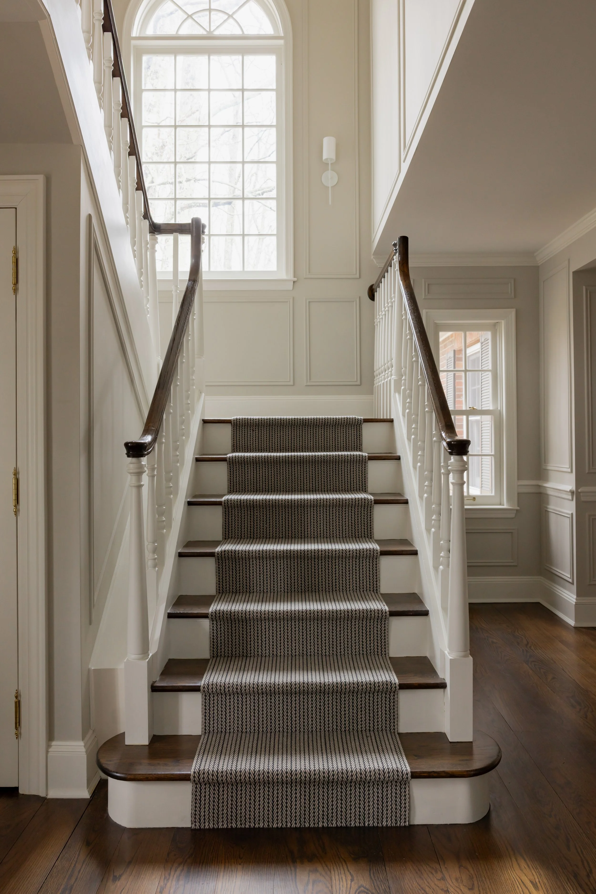
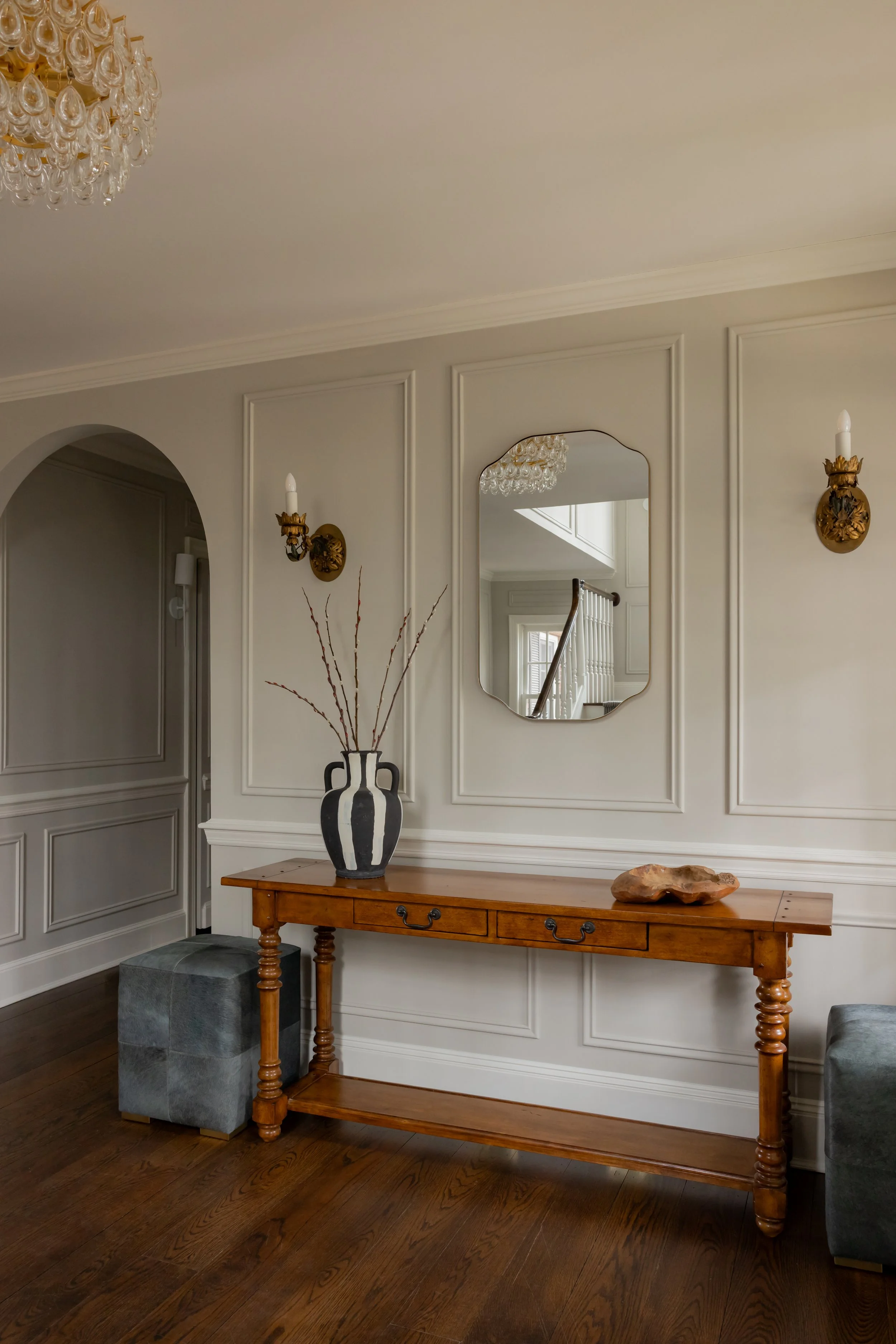
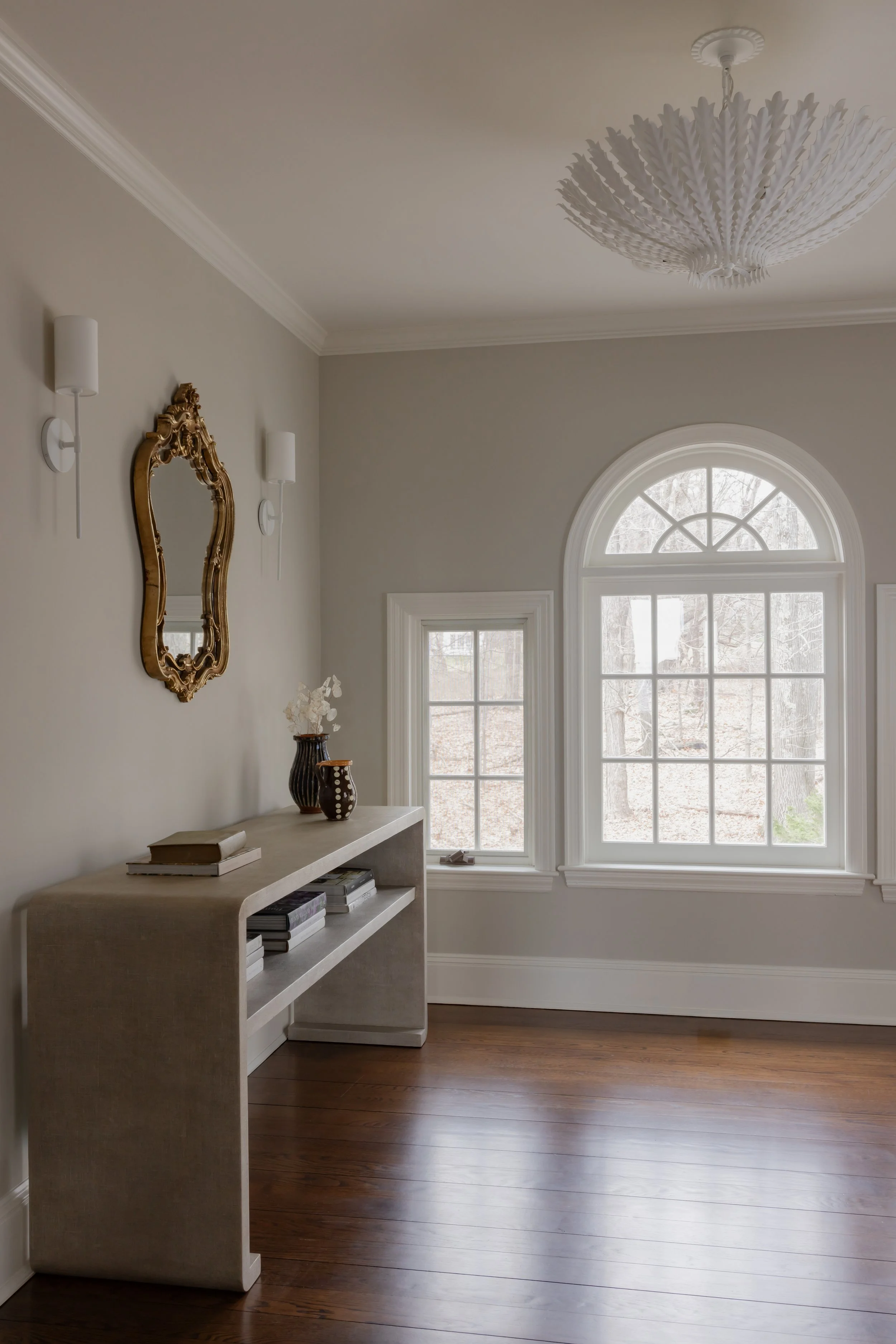
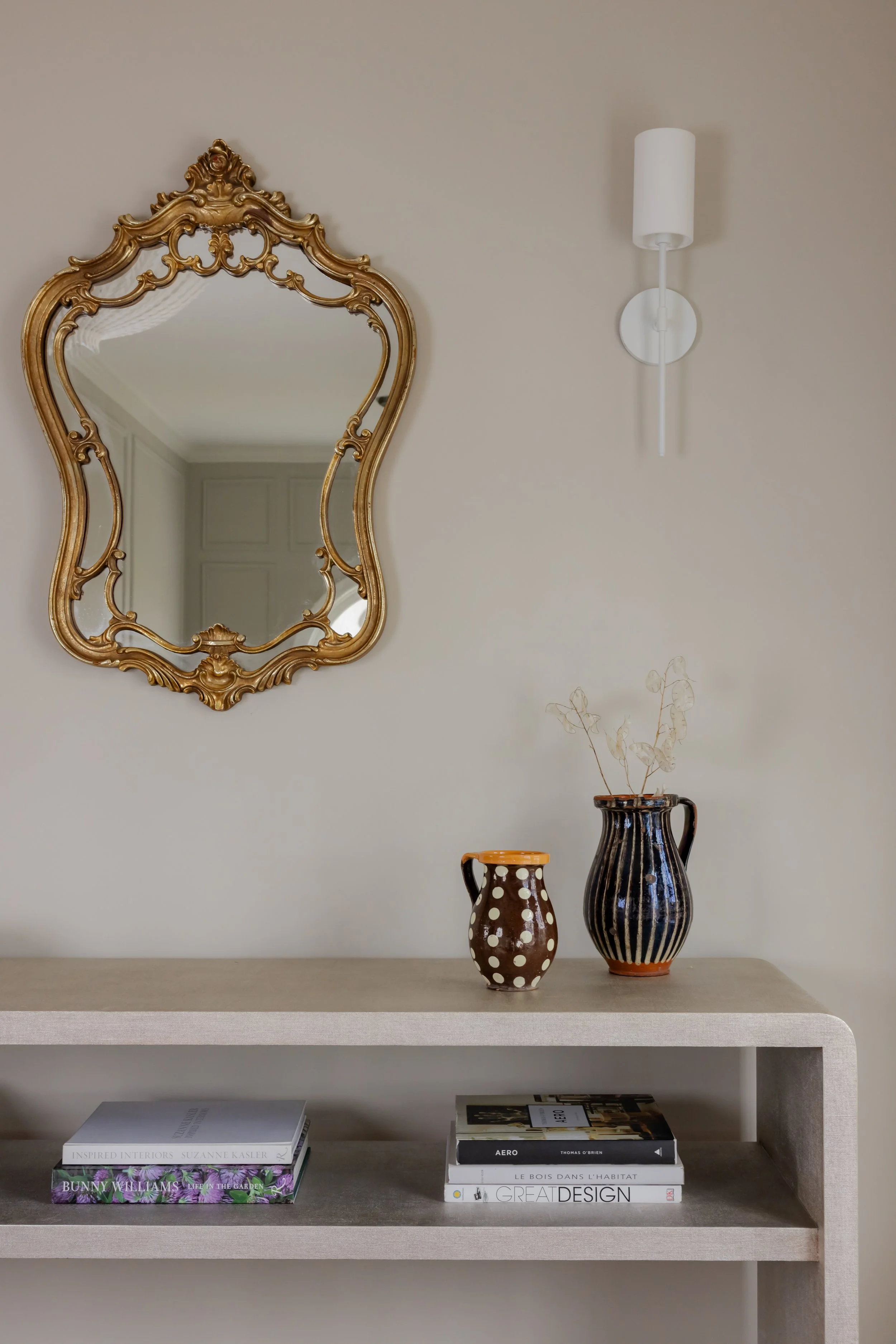
We kept the changes in the foyer measured. A new mirror, sconces, and overhead light, with a new Roger Oates runner underfoot, set a lighter tone the moment you walk in.
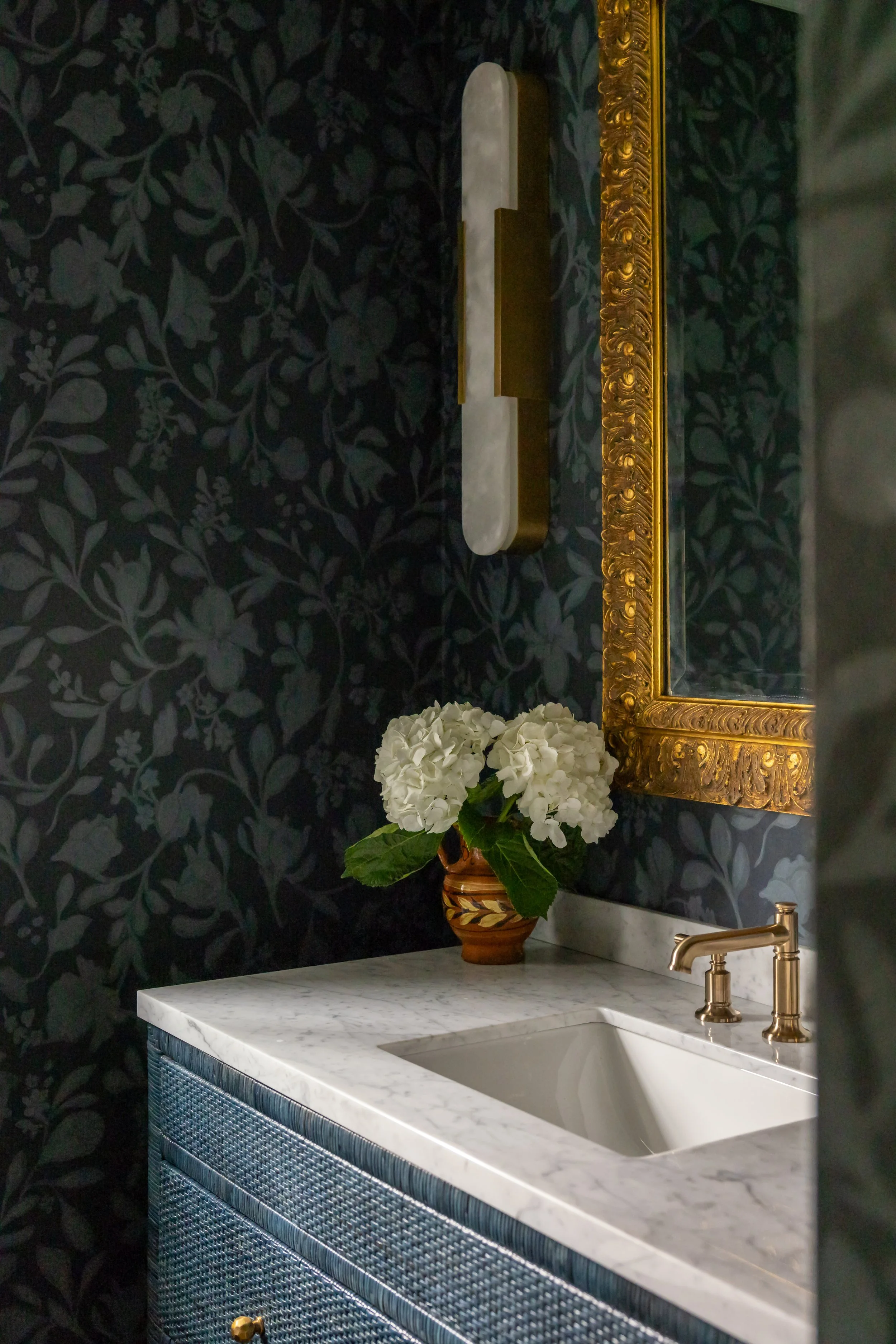
The powder room needed more than a refresh. We removed a soffit and the wall-to-wall mirror to open up the room, then added wallpaper, a beautiful client pre-owned mirror, alabaster sconces, and a freestanding blue rattan vanity from Made Goods.
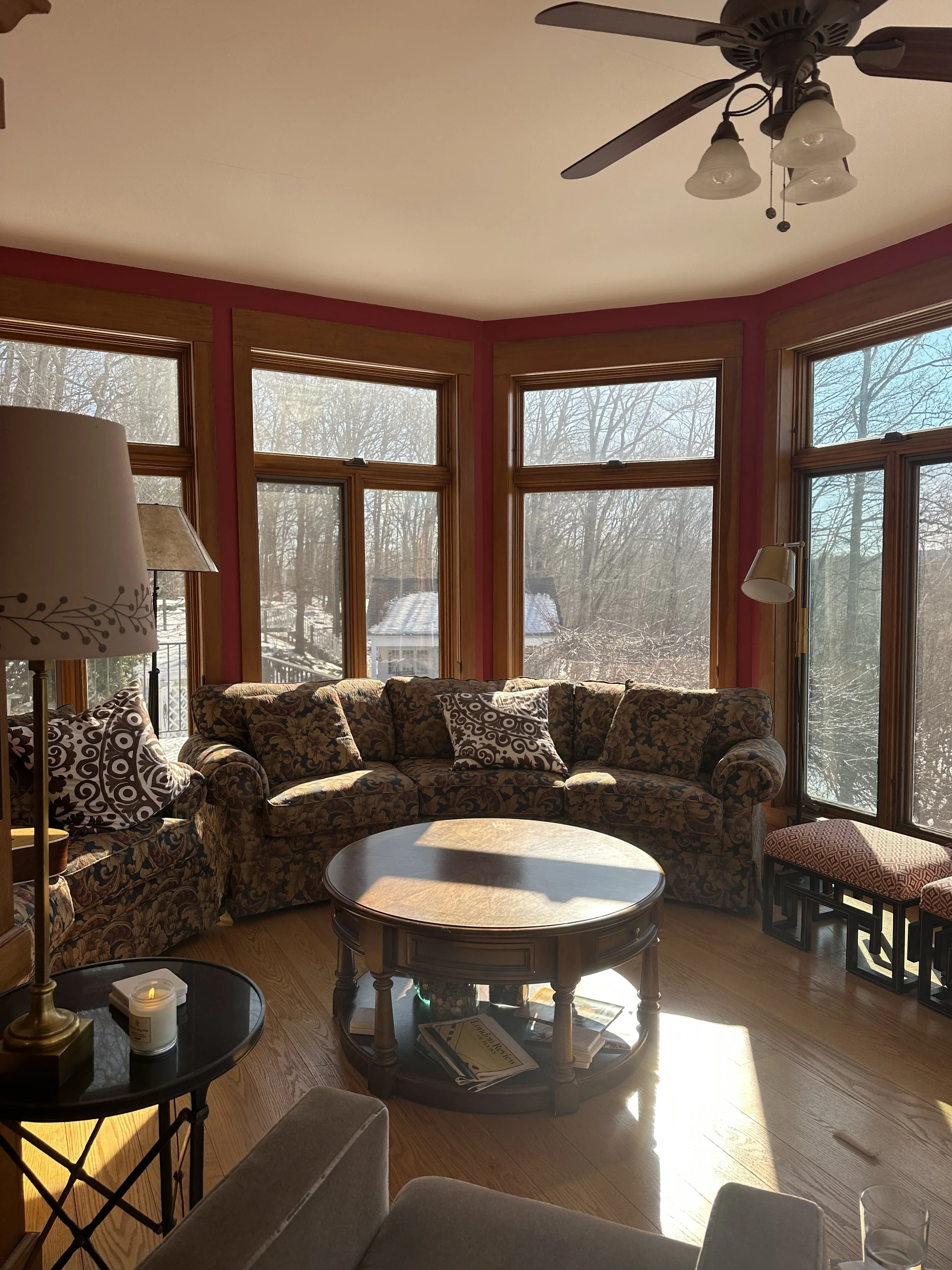
Before
Painting the wood trim is never a decision we take lightly, but in the sunroom it was the right call. Between the red walls, the roll arm sofas, and the trim running throughout, the room had been frozen in time. We painted everything, walls and trim alike, in a fresh color chosen to bring a sense of peace into the space.
That calm backdrop let us be bolder with the furniture. A custom blue mohair sectional, designed specifically for the space, adds a pop of color, and at the opposite end a walnut extendable dining table sets the room up for hosting.
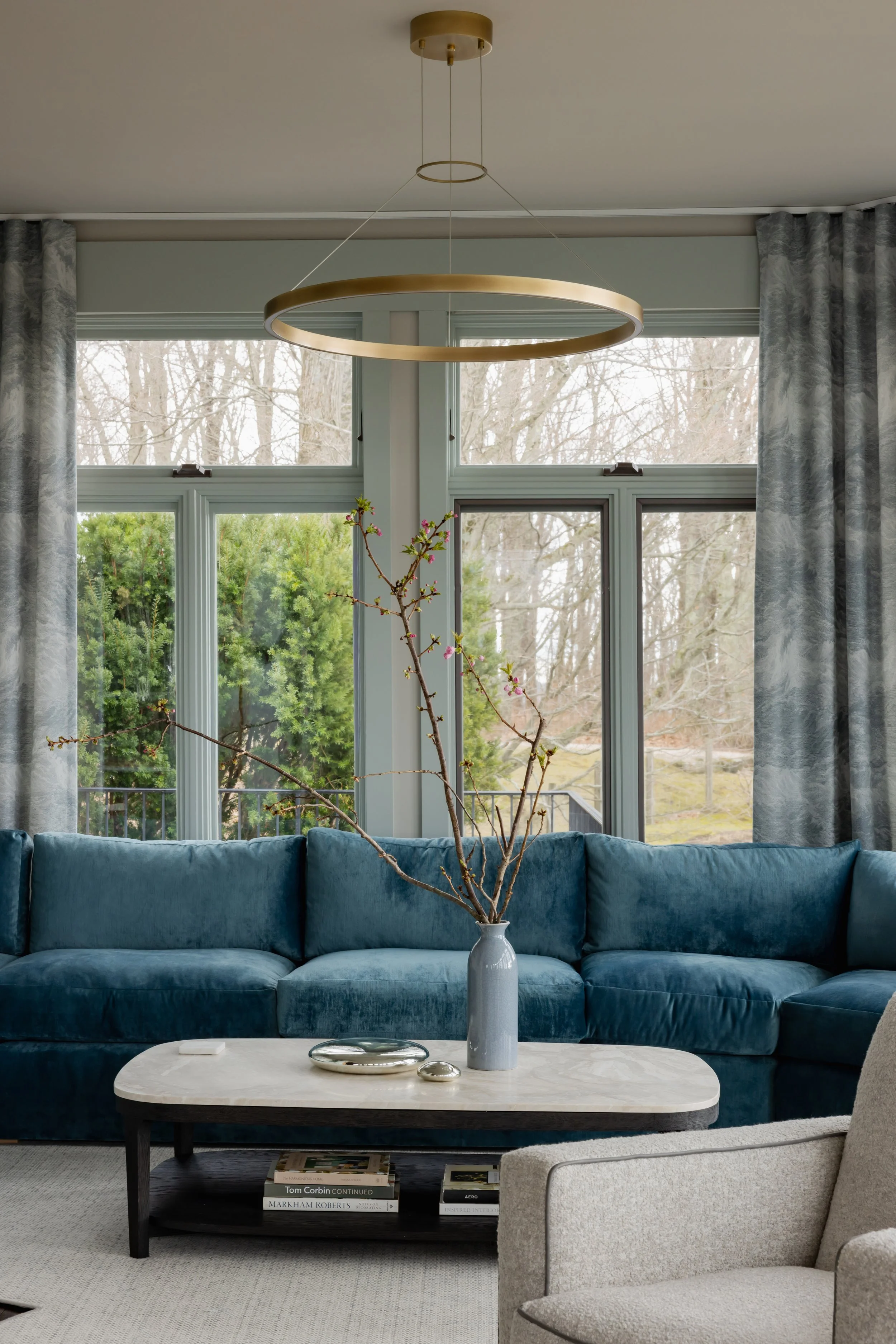
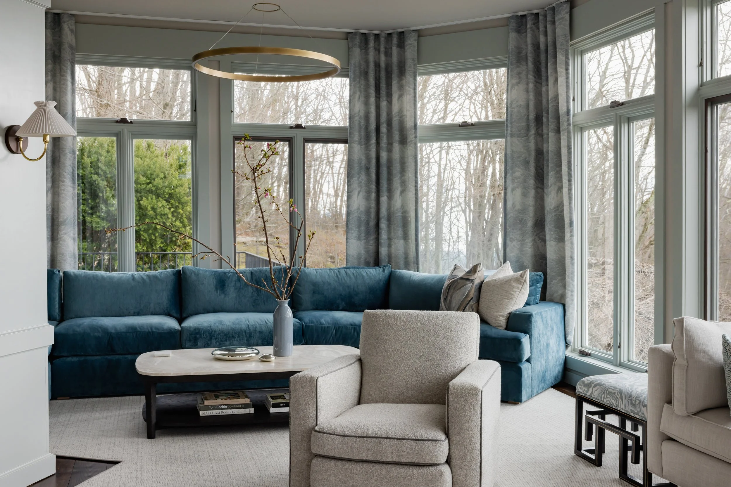
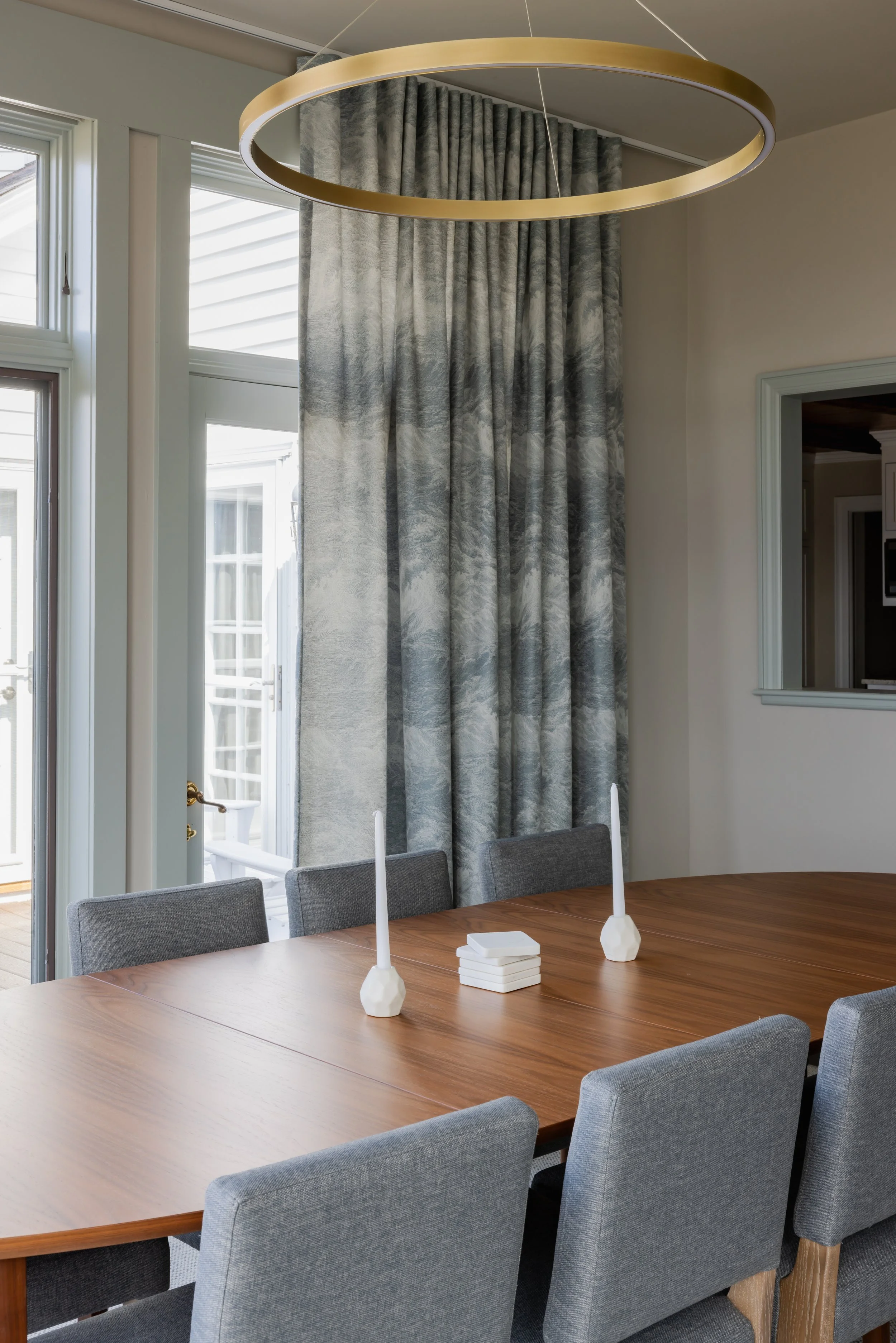
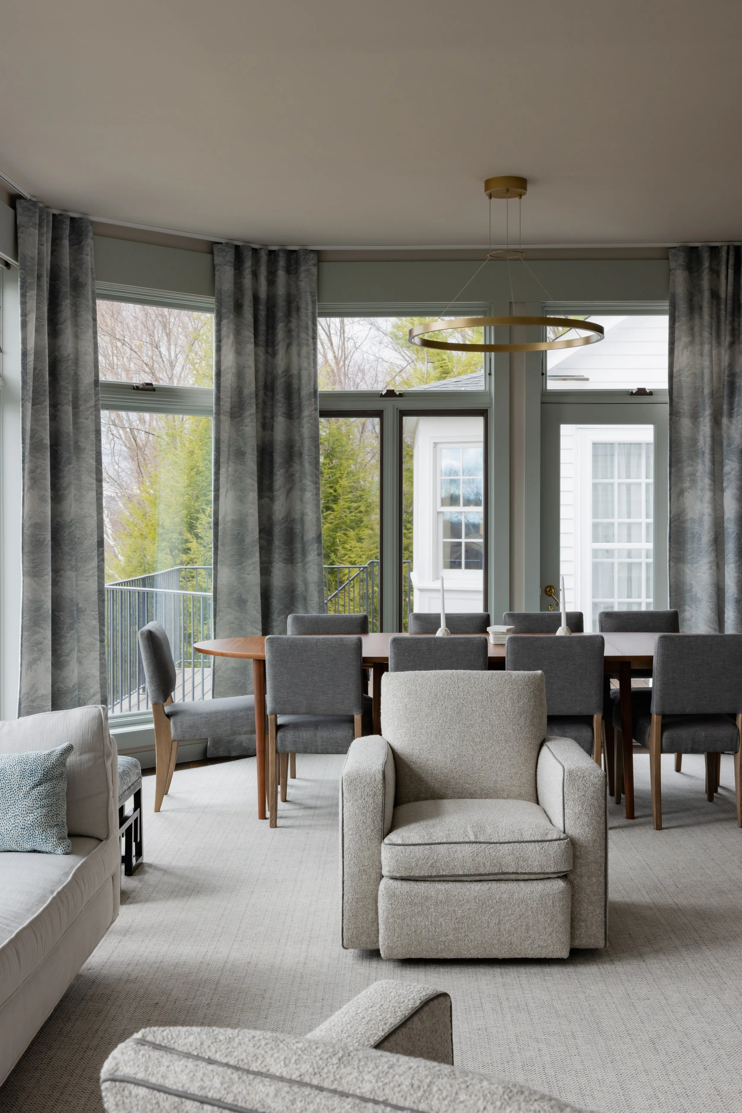
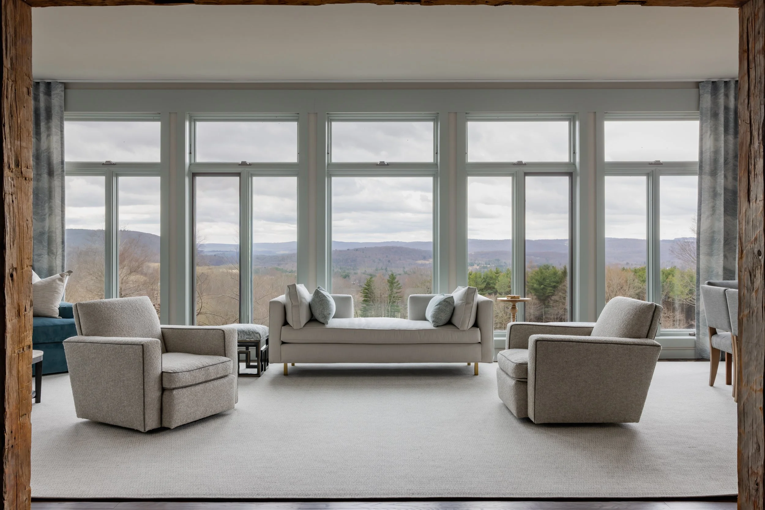
The sunroom is also the focal point you see as soon as you walk into the home, so every choice there had to respect the view. We chose a low, open-backed chaise that leaves the sightline clear and still draws you into the room. Every piece was chosen to bring the space into the present without losing the ease a sunroom should have.
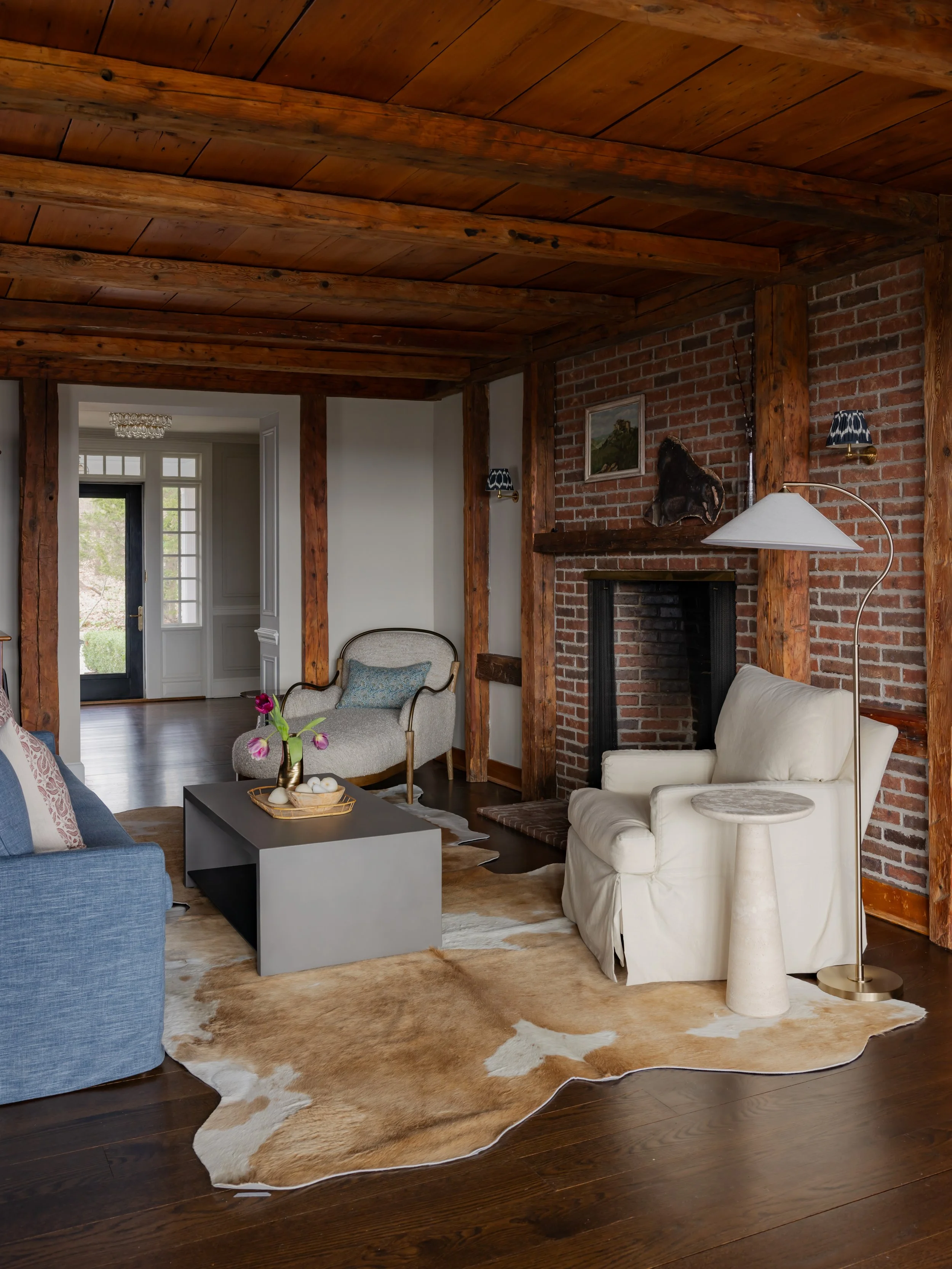
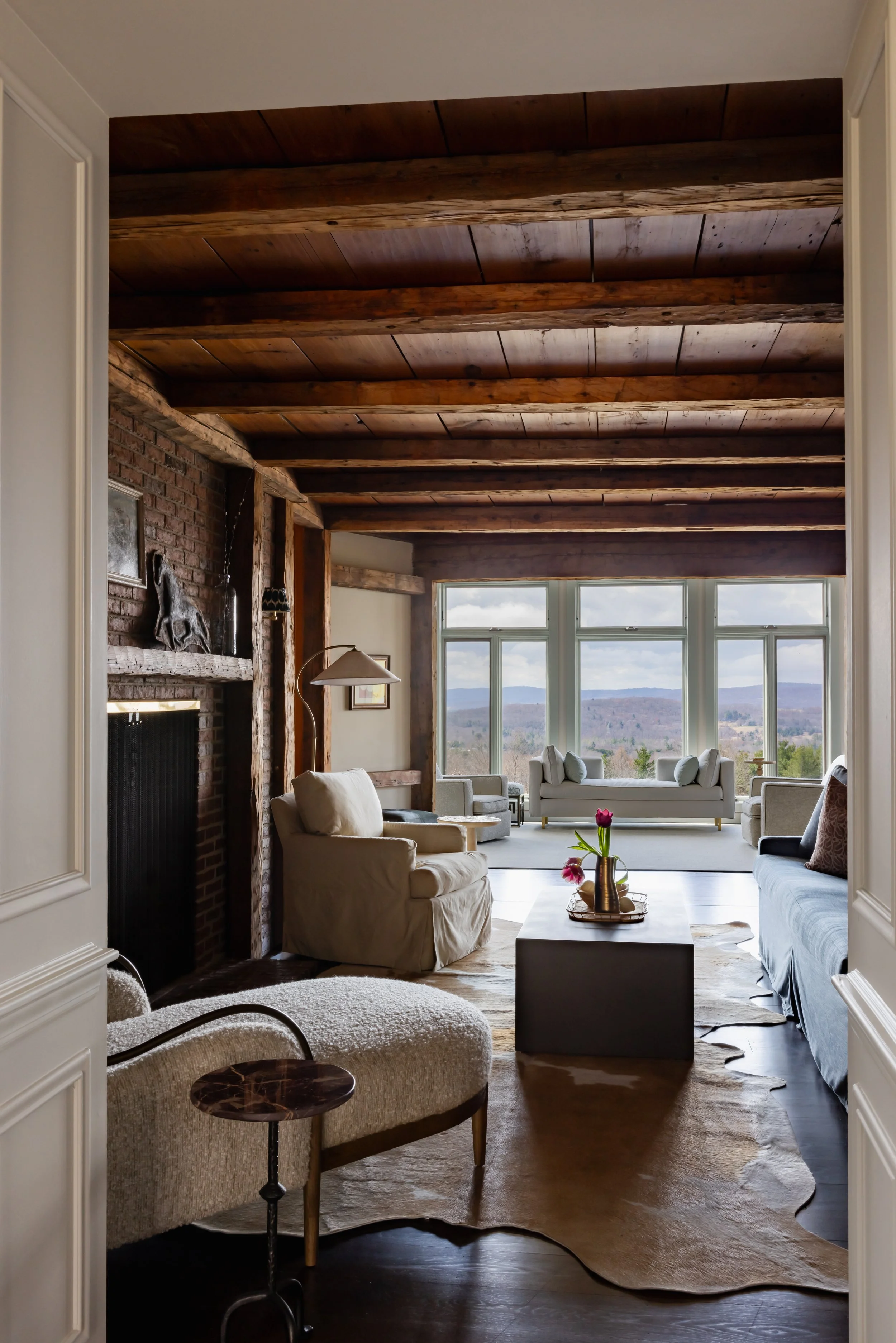
The wooden beams overhead set the direction here, so we kept the room country. Our goal was to make it warmer and cozier than before, and we added a chaise and a coffee table scaled to the space.
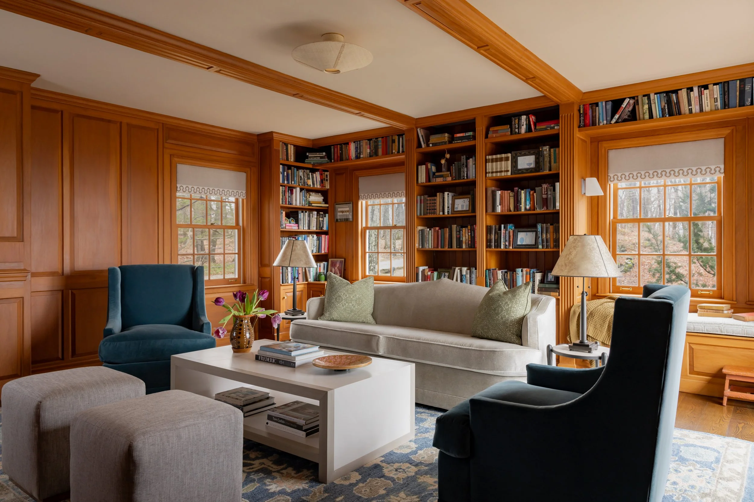
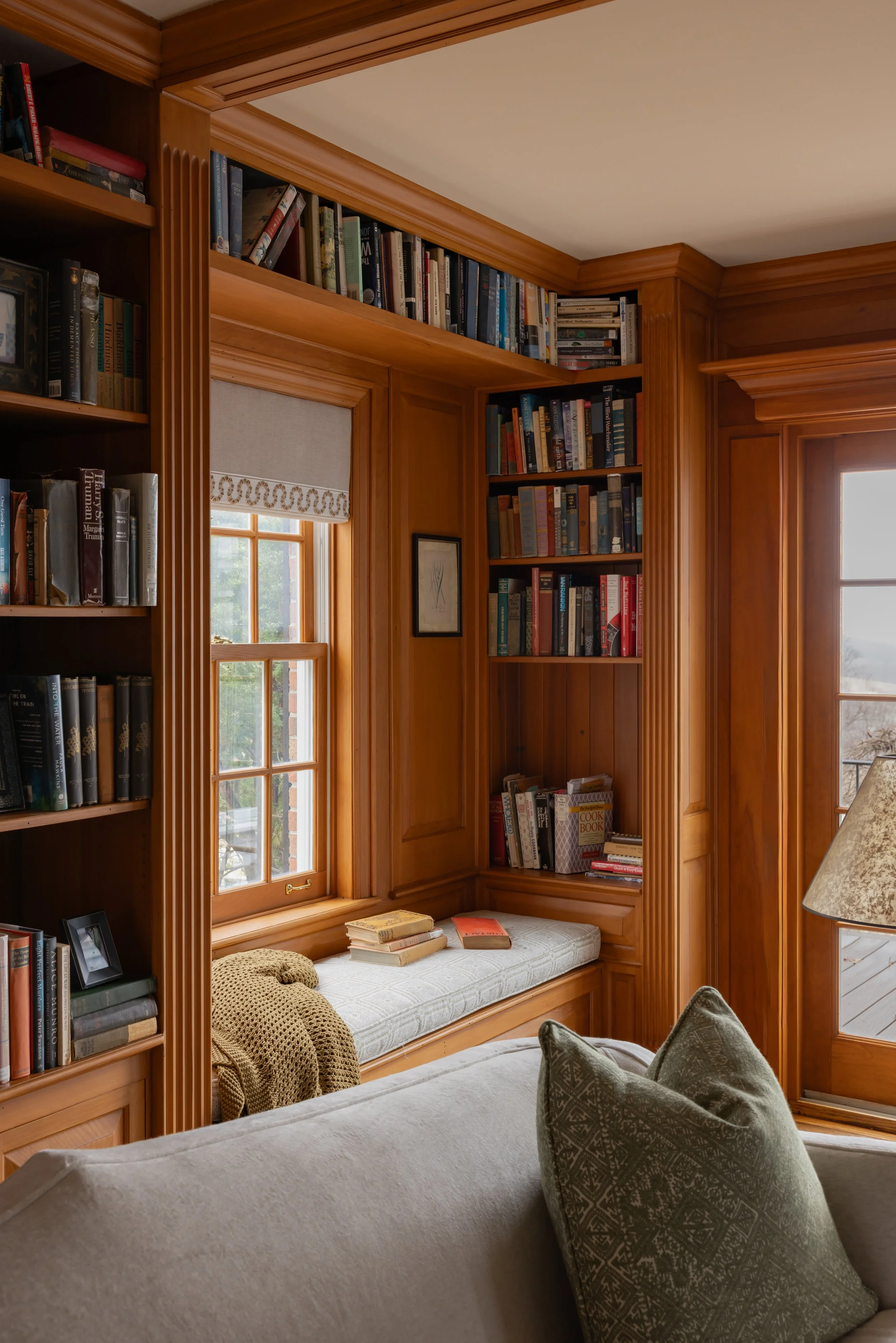
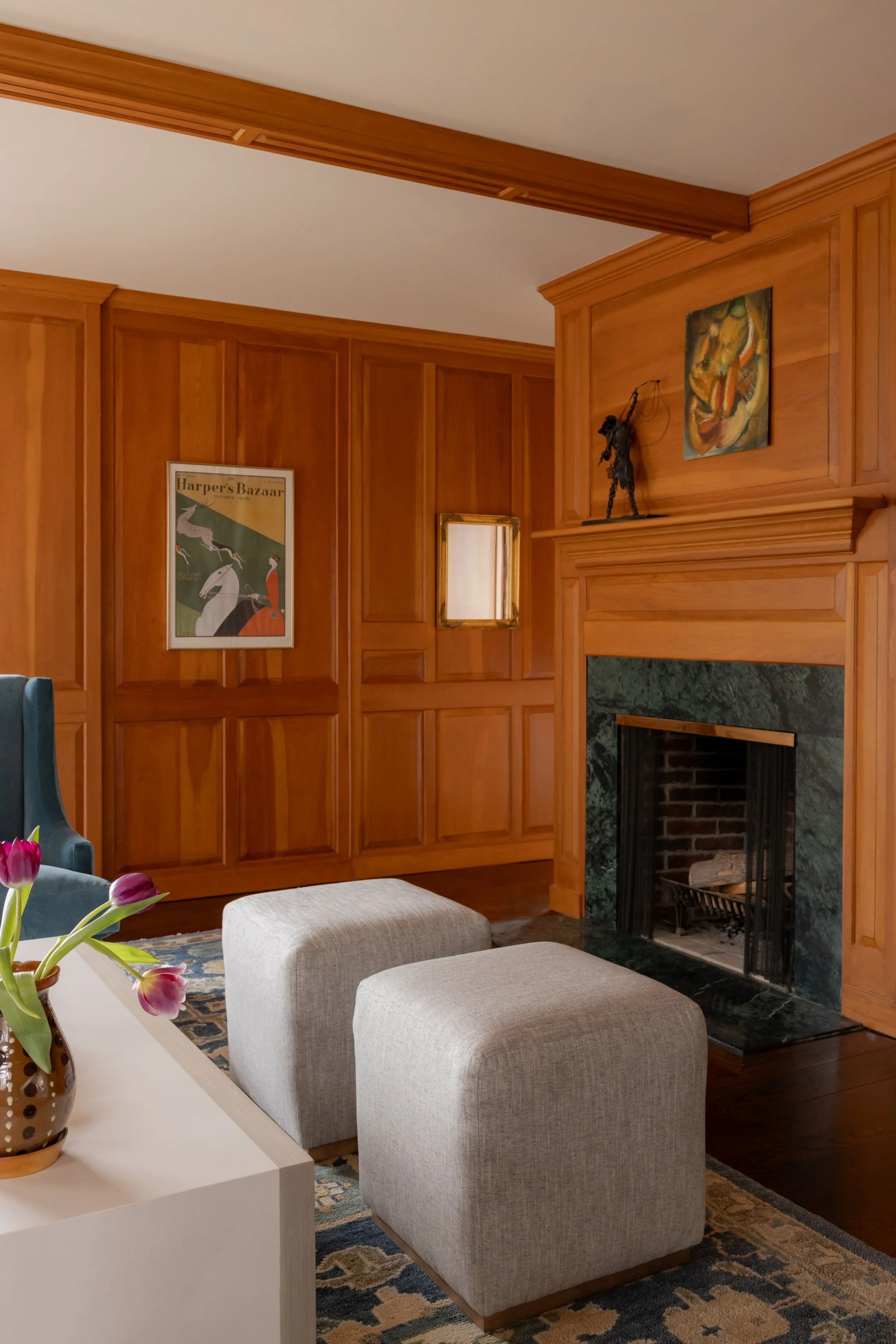
We kept all of the Library’s wood paneling and changed out the furniture. The result is a room that feels formal and cozy at once, made for lounging and game nights.
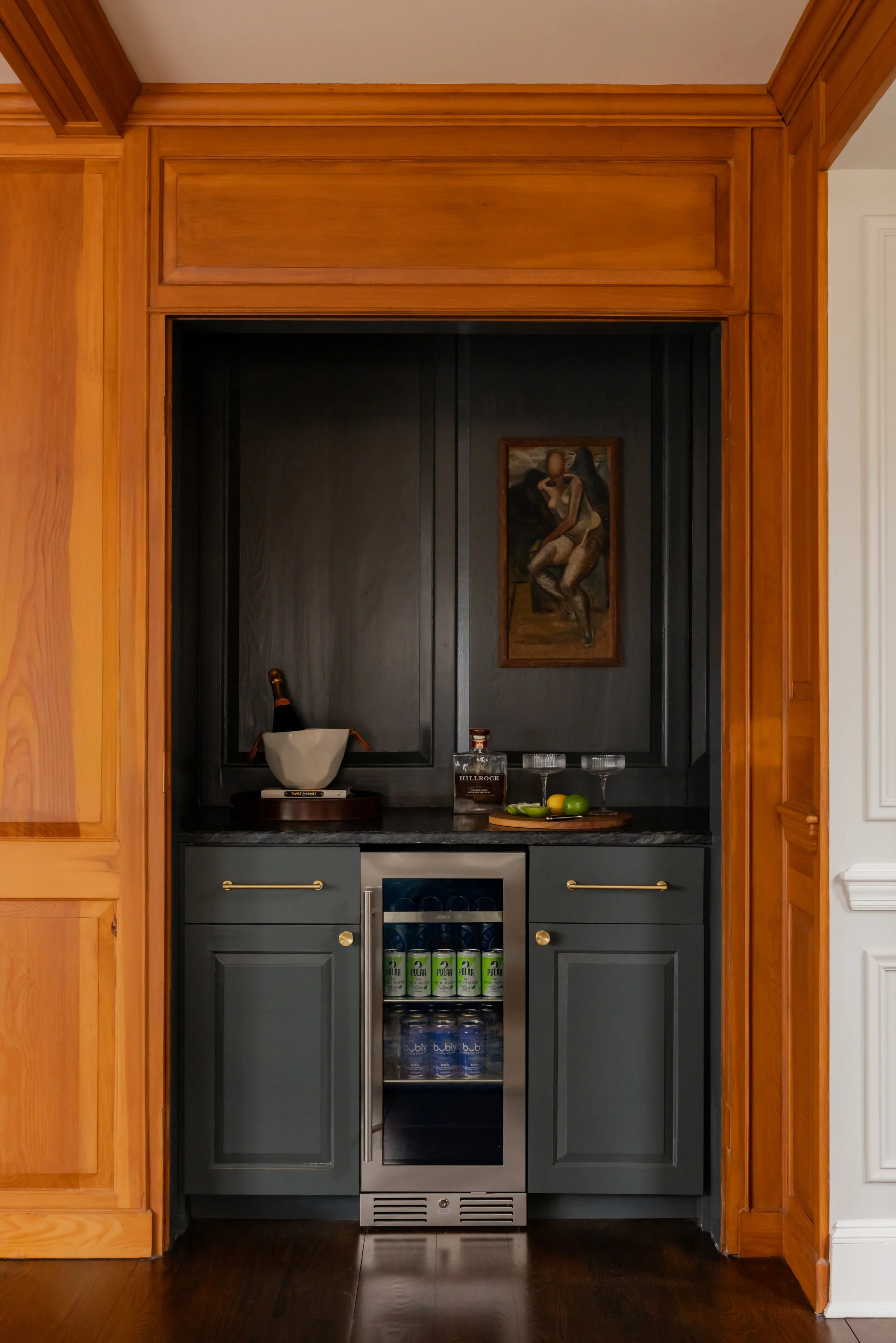
The bar was completely overhauled. We removed the sink, added a countertop and a new beverage fridge, and painted it a new color. It’s the only place in the Library where we painted the paneling, so the bar reads as its own moment within the room.
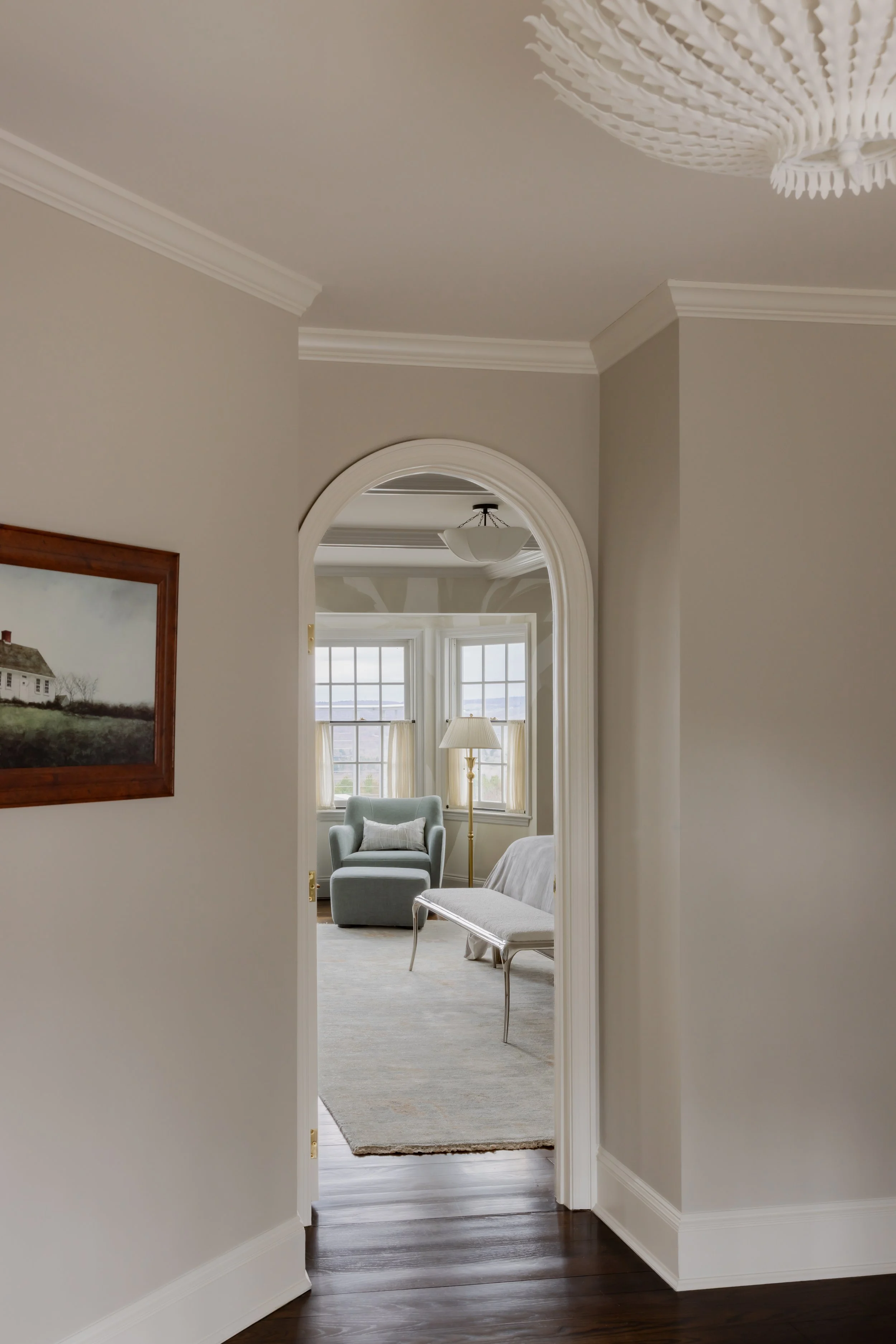
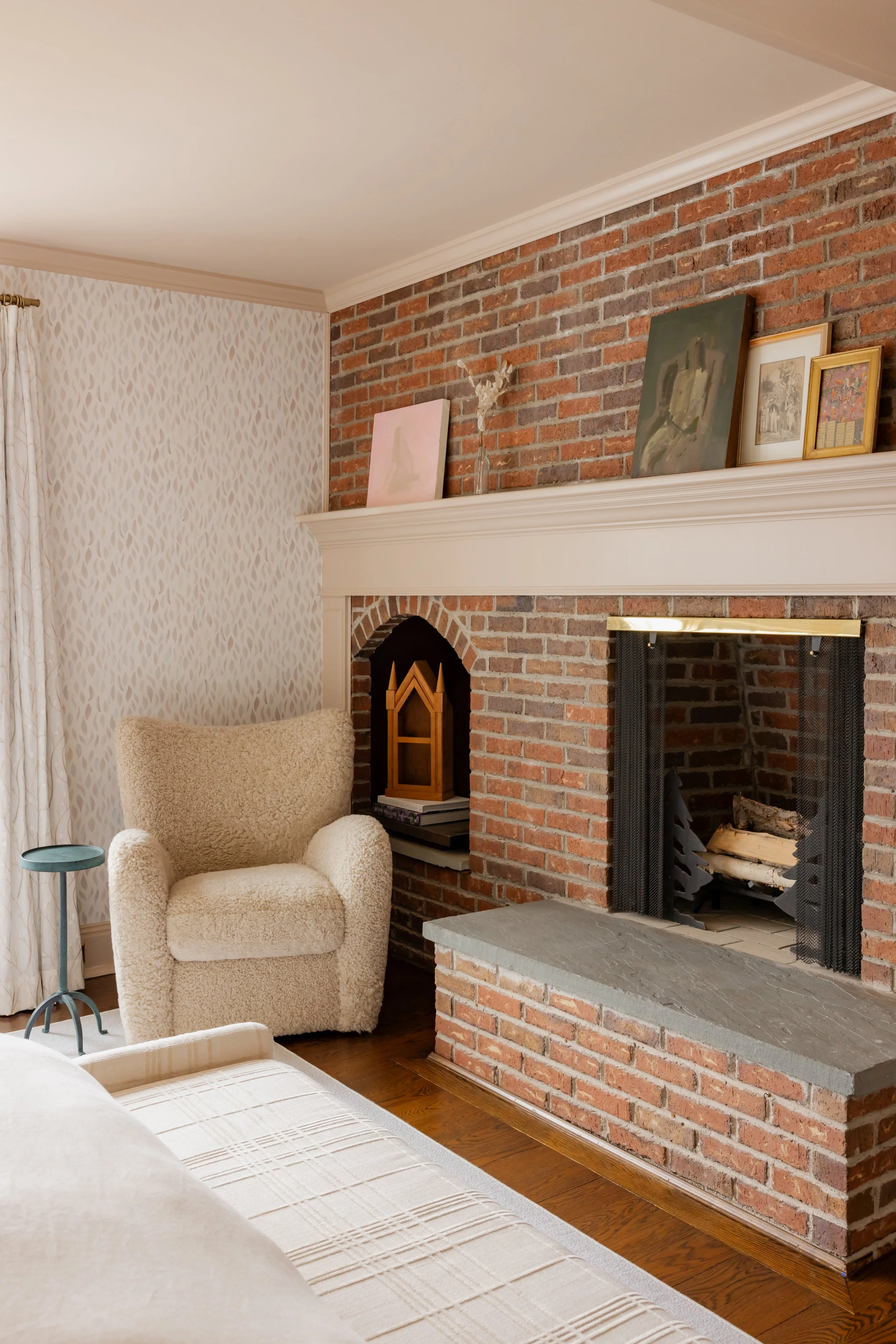
Upstairs in the primary bedroom, the first priority was privacy. An opening connected the room to the girls’ room next door, so we closed it off to give each space its own sense of separation. We replaced the outdated wallpaper with a large-scale print from Belarte Wallpaper, which gives the room presence without overwhelming it.
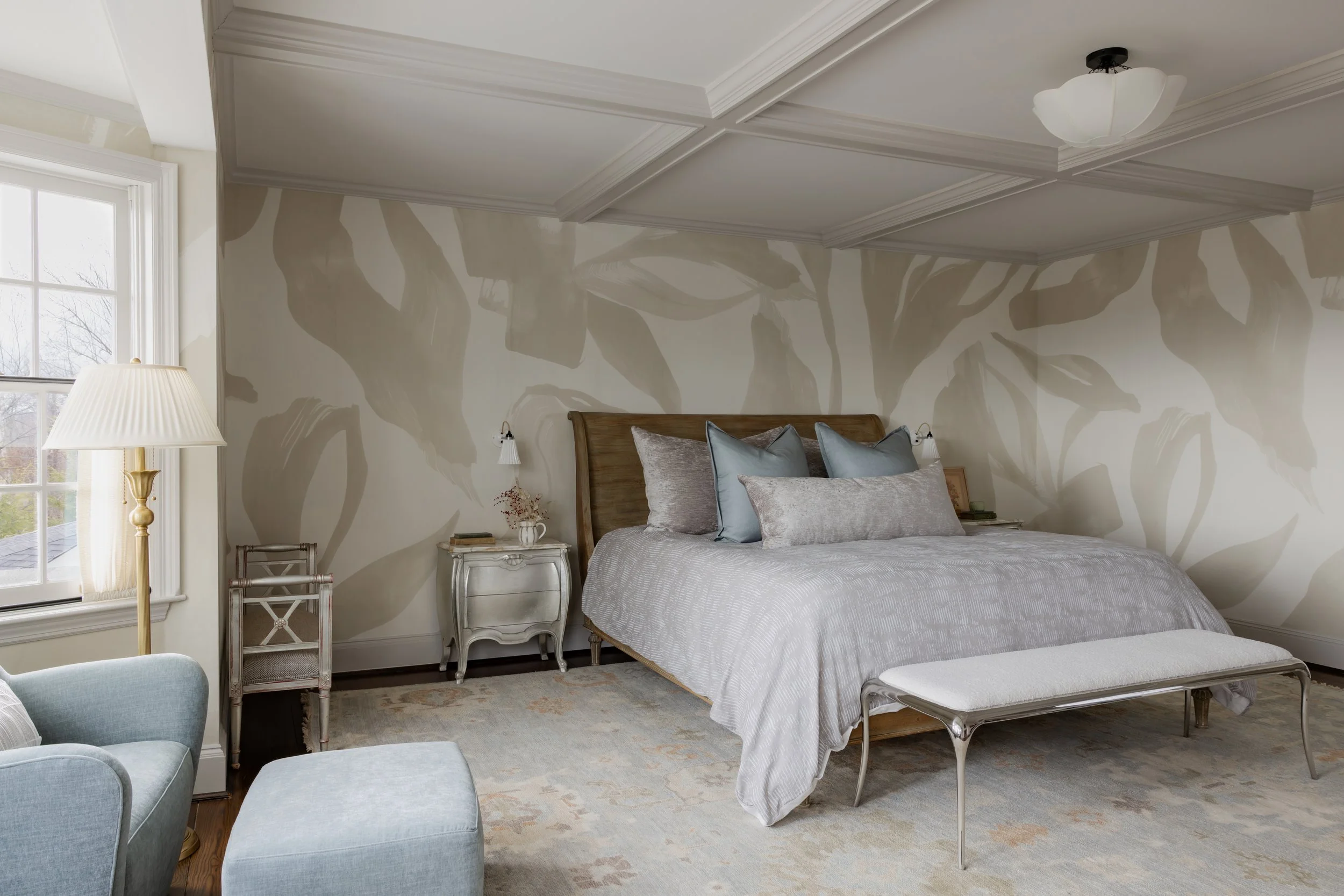
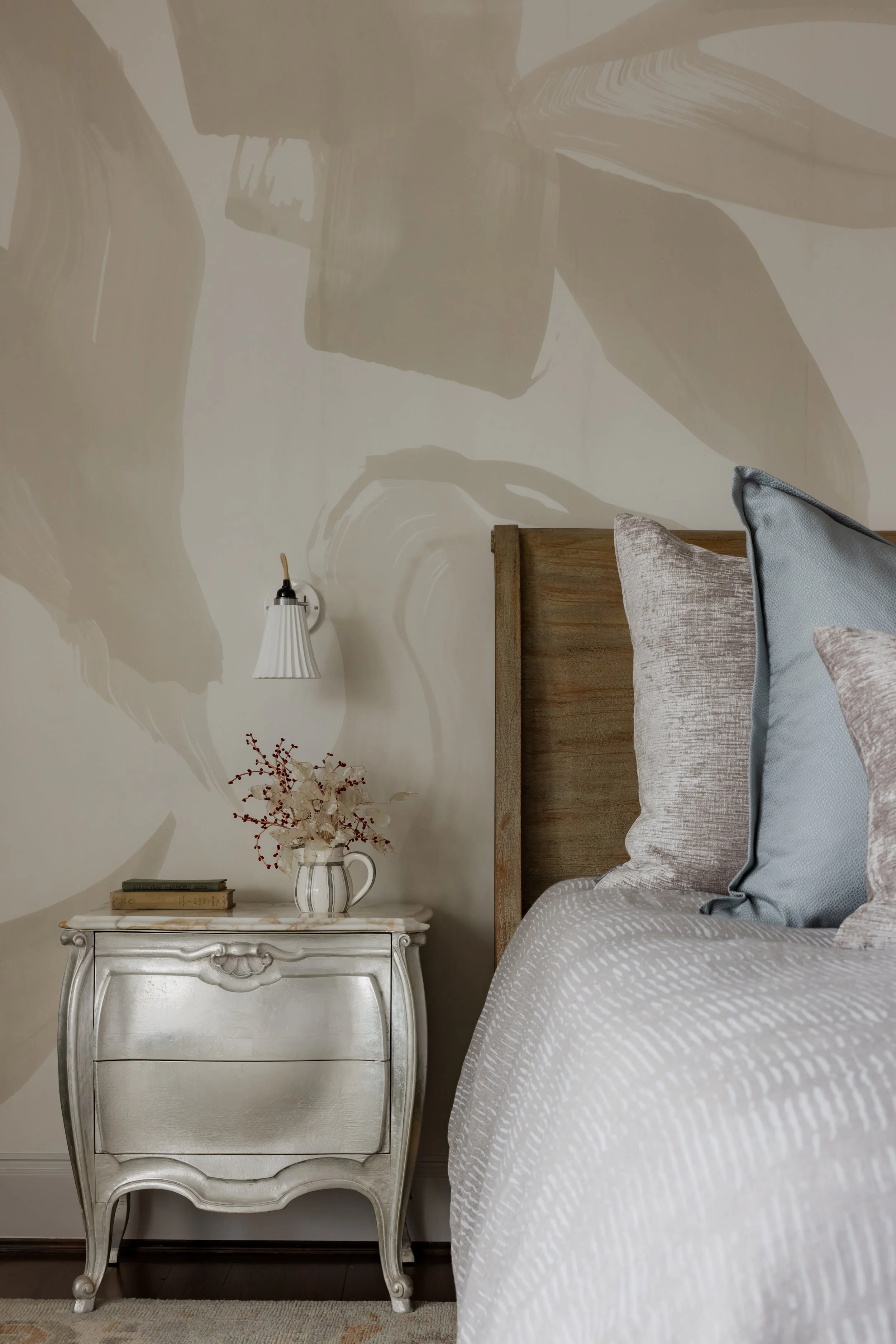
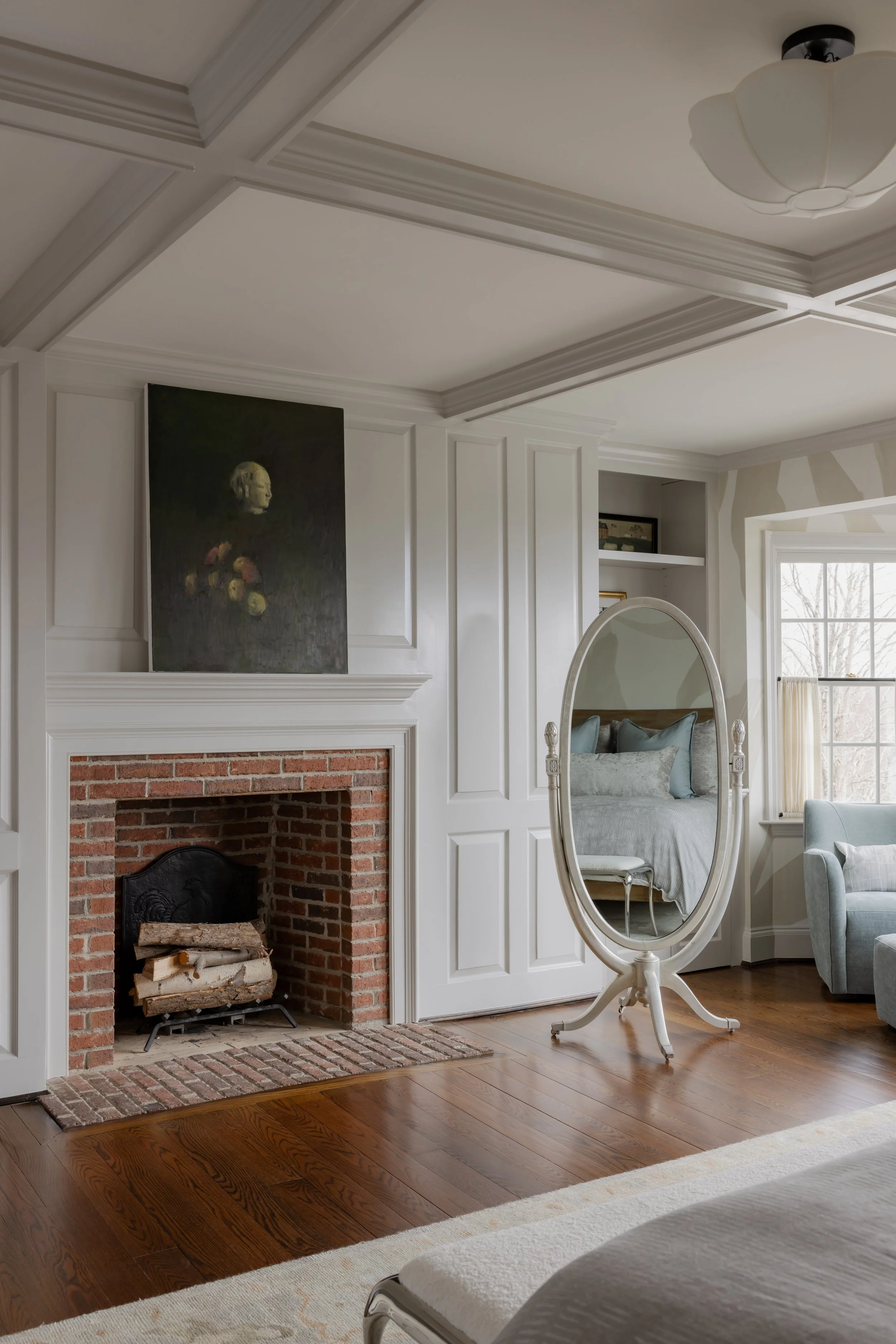
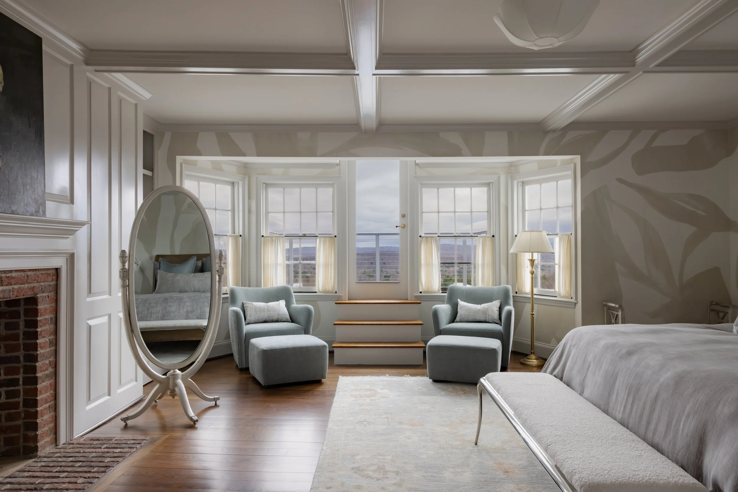
From there, we built a color scheme around the silvers, beiges, and blues in the space, so everything feels connected and restful. Above the fireplace hangs a portrait by Peter Cusack, which anchors the room and gives it a personal, collected feel.
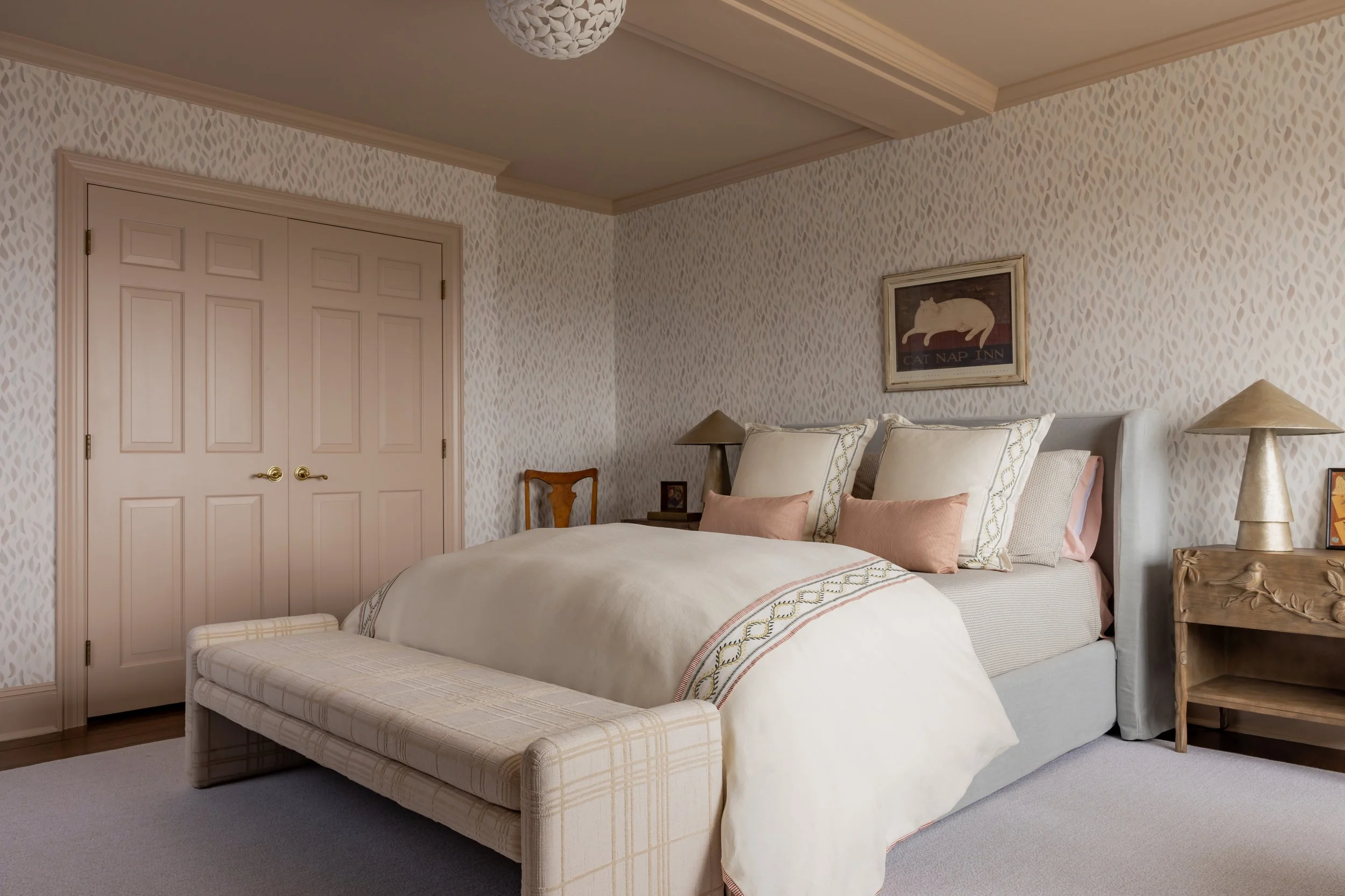
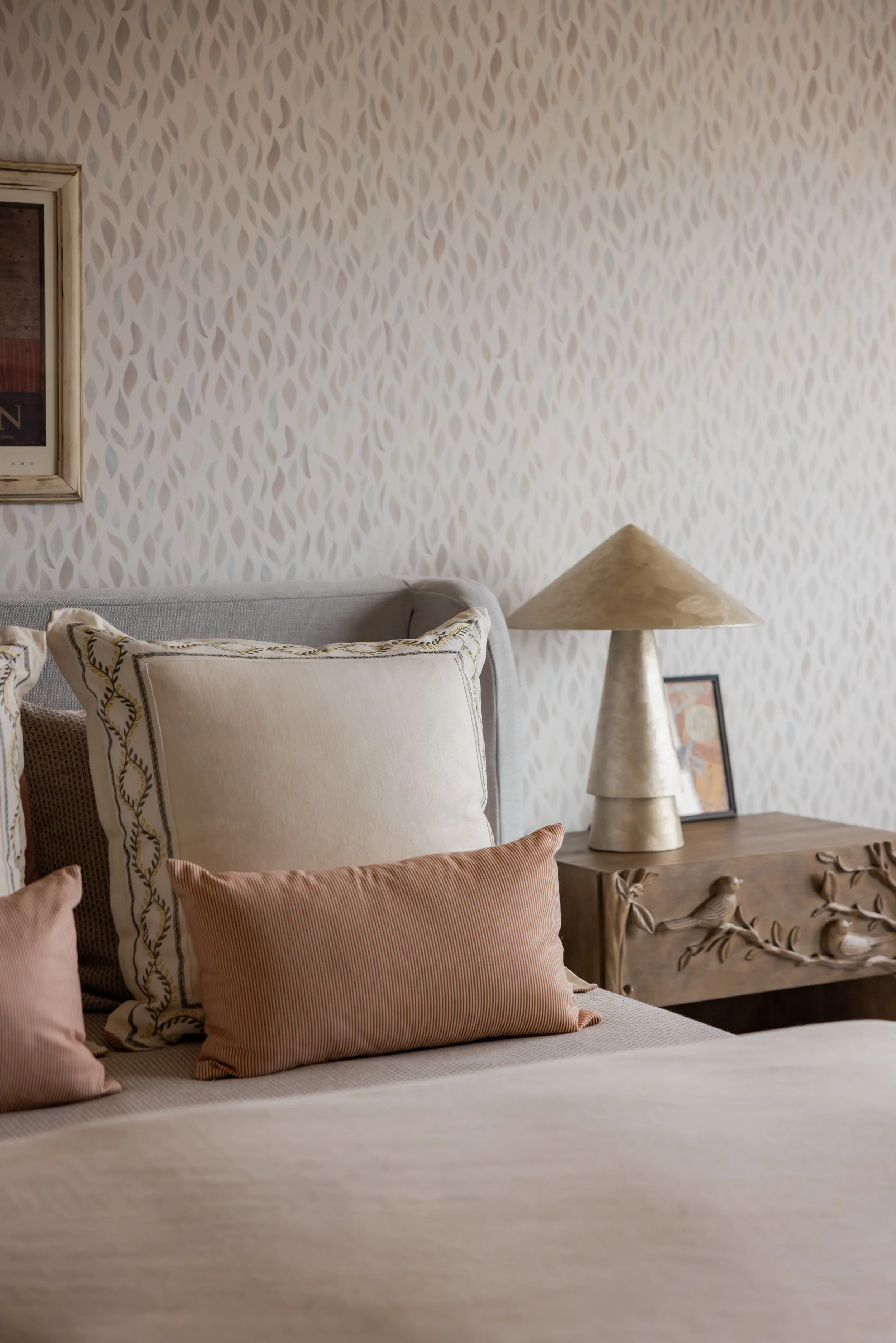
In the girls’ bedroom, we leaned into a softer, more feminine feel, starting with a mauve paint color and a watercolor wallpaper from Rebecca Atwood with a petal-like pattern. We wanted the room to feel feminine but mature enough to grow with them, so we built the palette around that motif. We also rethought the layout. Moving the bed let us put the desk in front of the window, where the view outside makes it a natural place to read, study, and daydream.
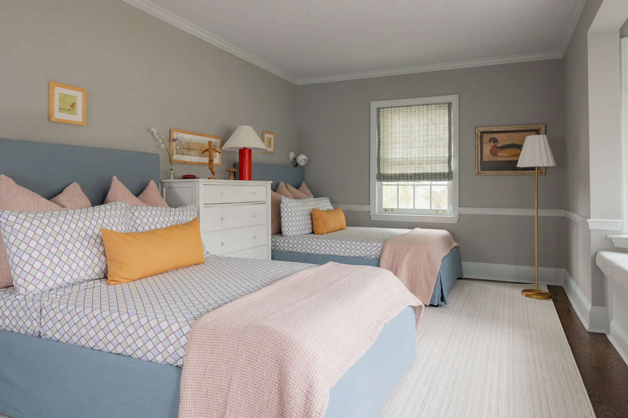
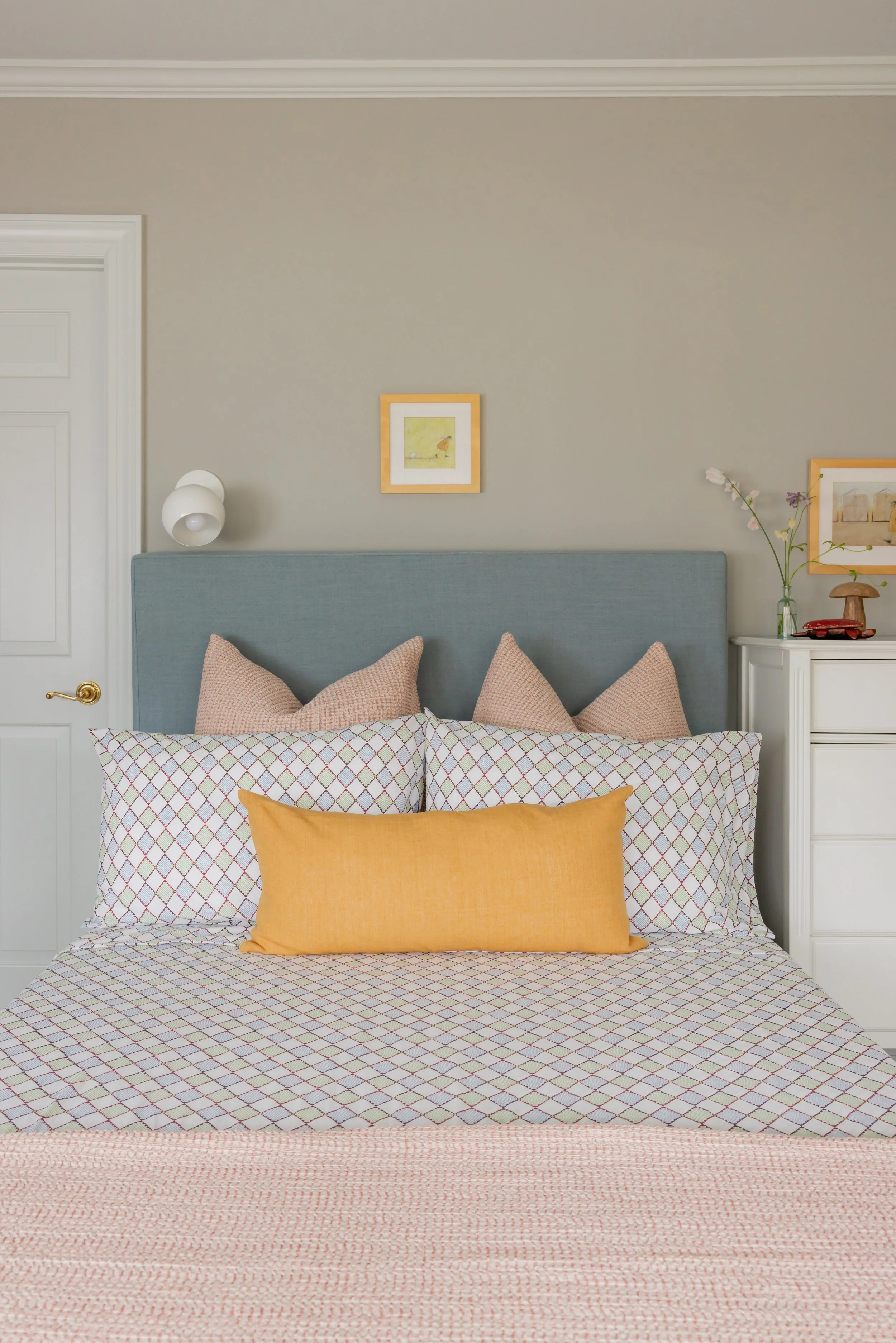
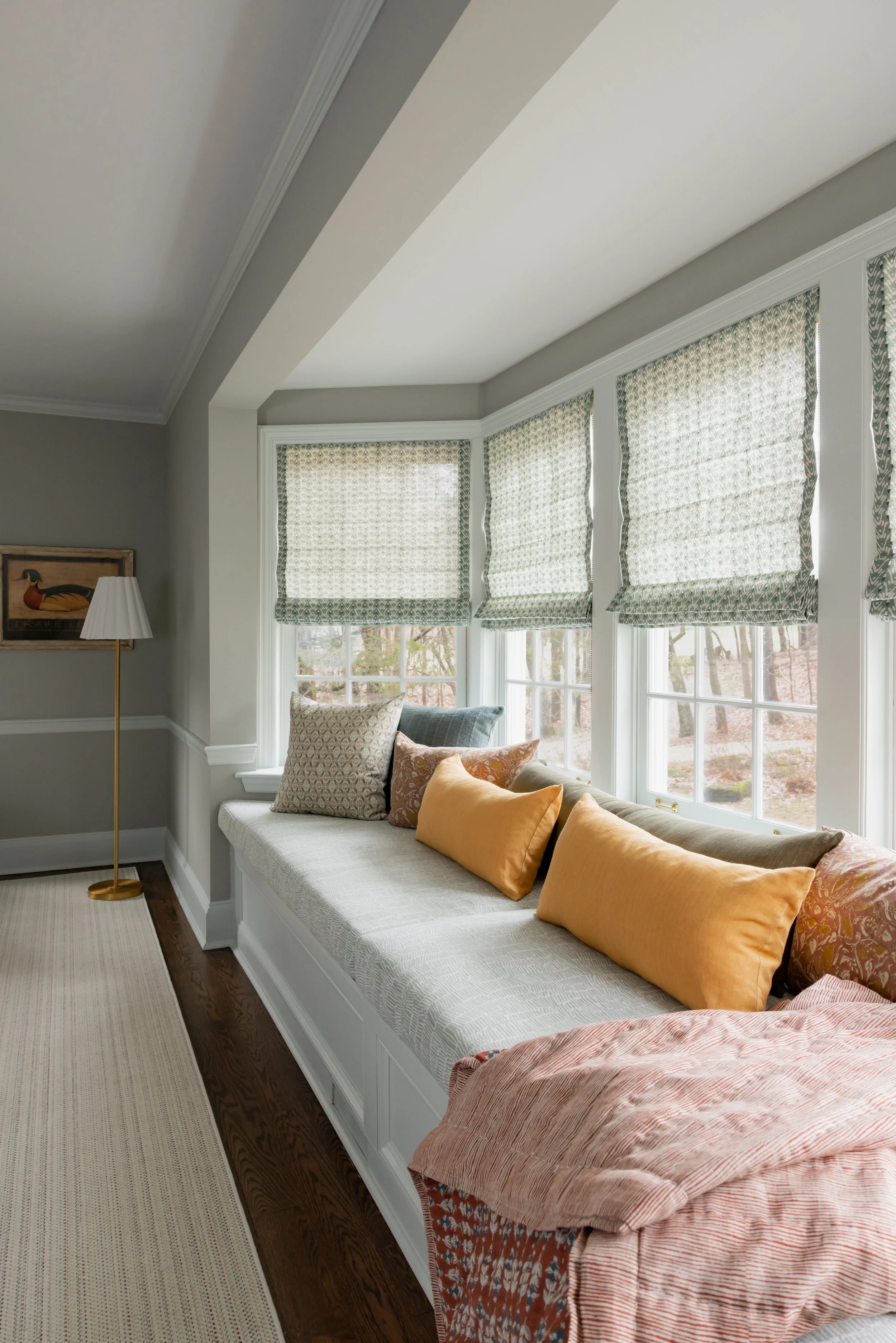
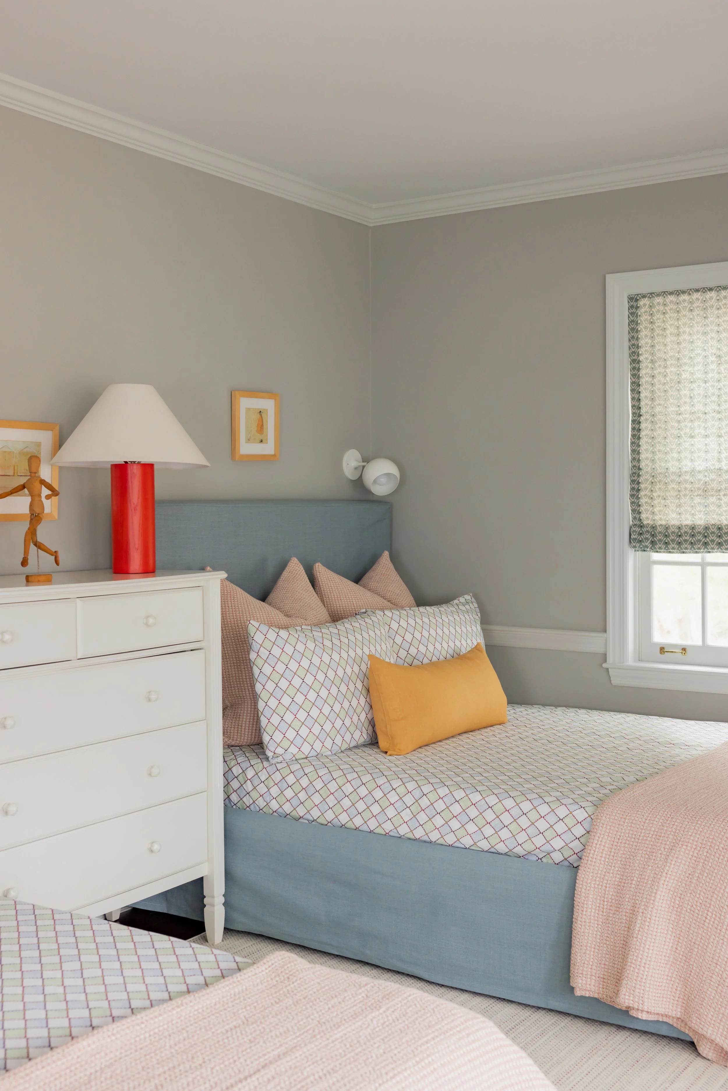
Downstairs, the twin guest bedroom had very little personality, so we gave it plenty. We turned it into a colorful room for children and guests, with pattern play across the bedding and roman shades that keeps the space lively without feeling busy. Under the windows, we turned an unused space into a proper window bench, finished with a custom seat cushion and a generous pile of pillows. It’s one of our favorite rooms in the project, and truly a fun little corner of the house.
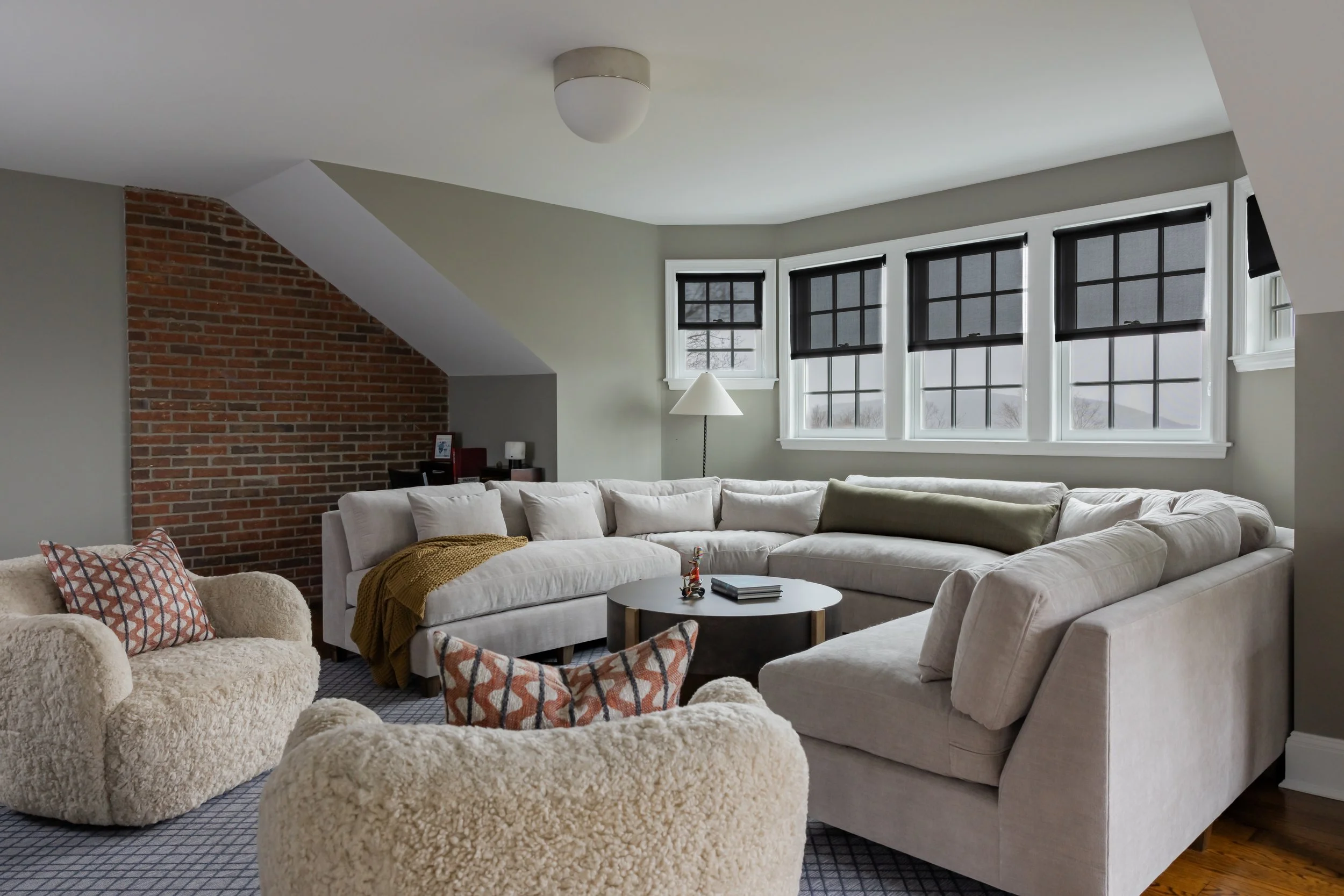
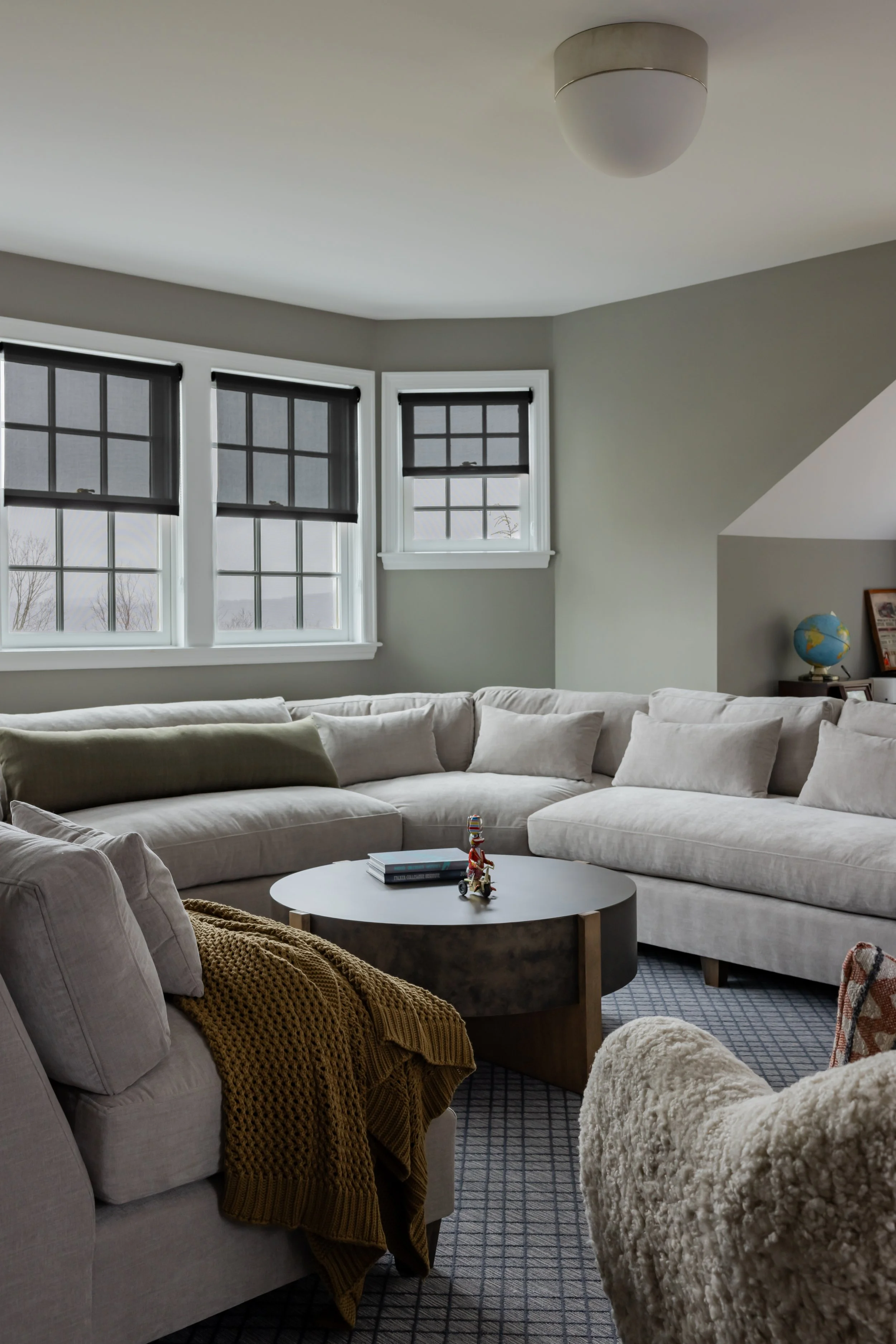
Upstairs in the boys’ wing, we turned the common space into a proper den. It’s a hangout for the boys, but we wanted it to feel grown-up and masculine, made for the young adults in the family rather than kids. As in the sunroom, we designed a custom sectional for the room, built to fit its angles exactly so that every inch of seating works.
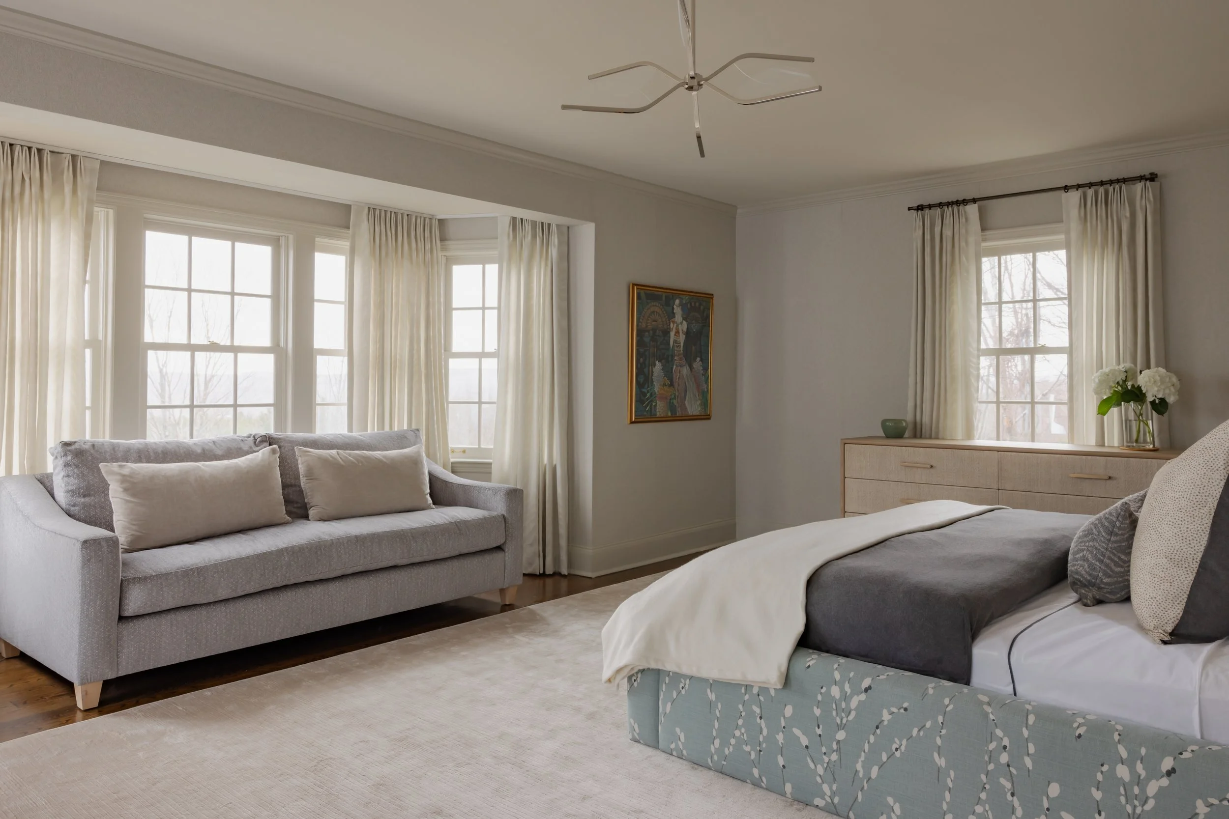
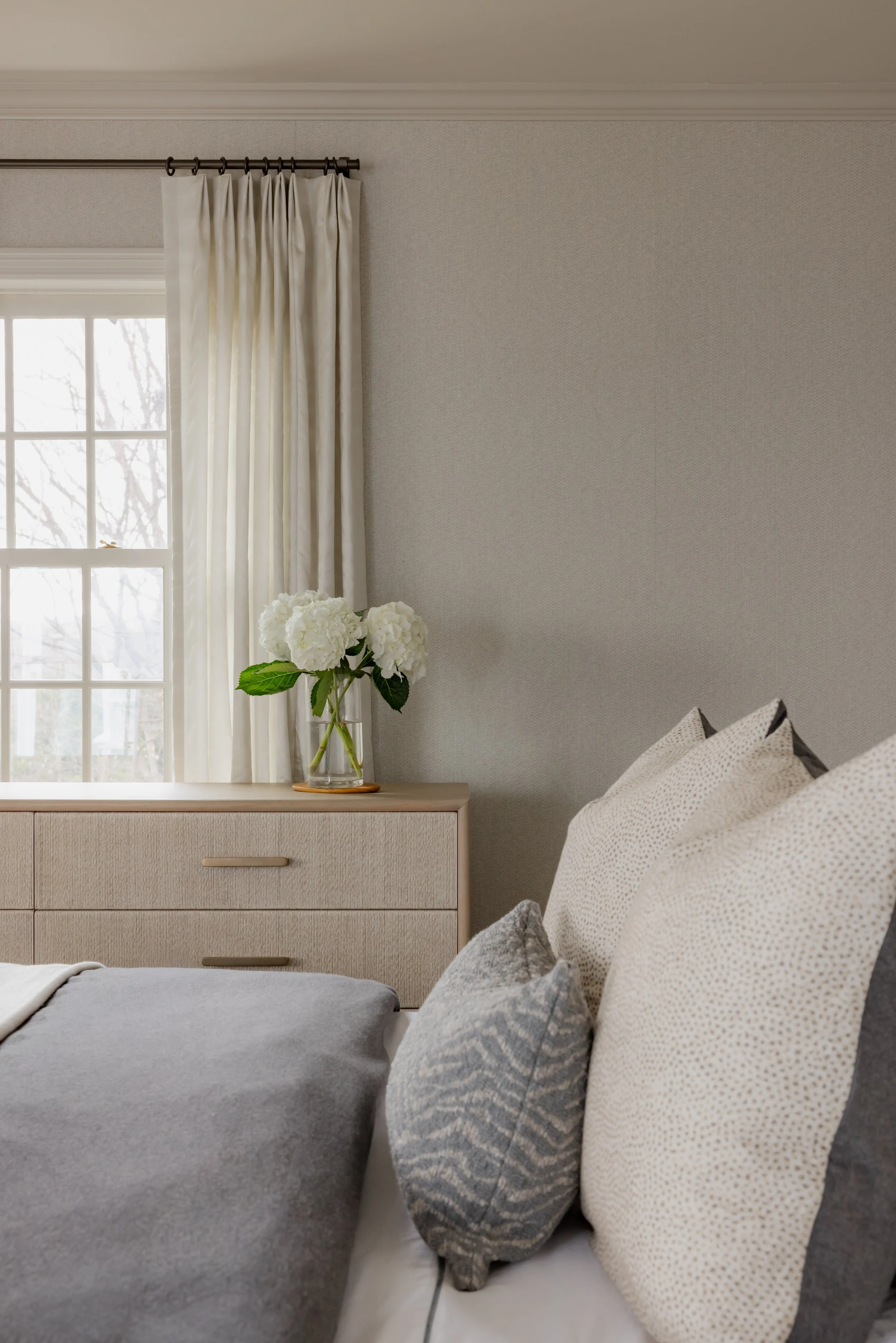
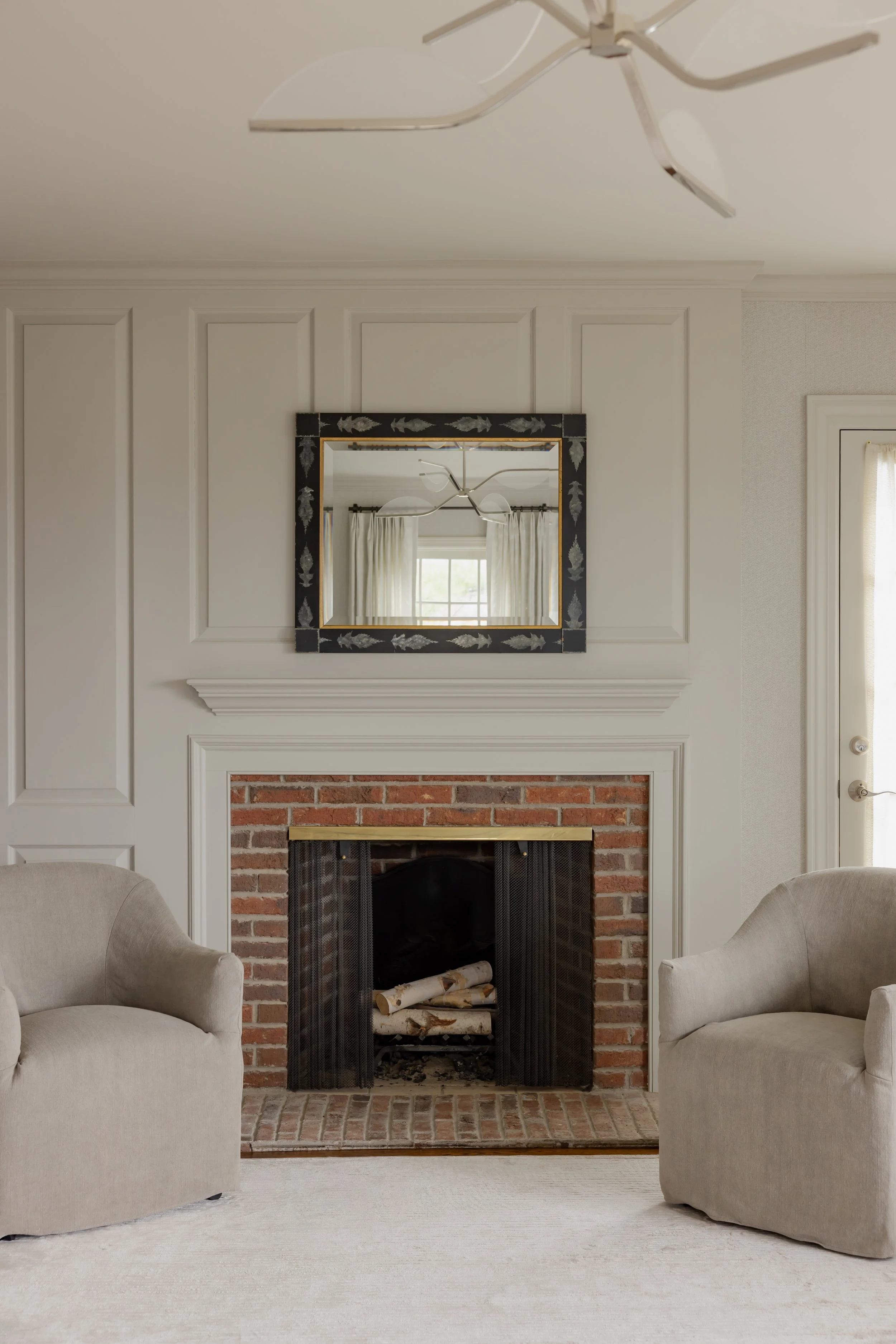
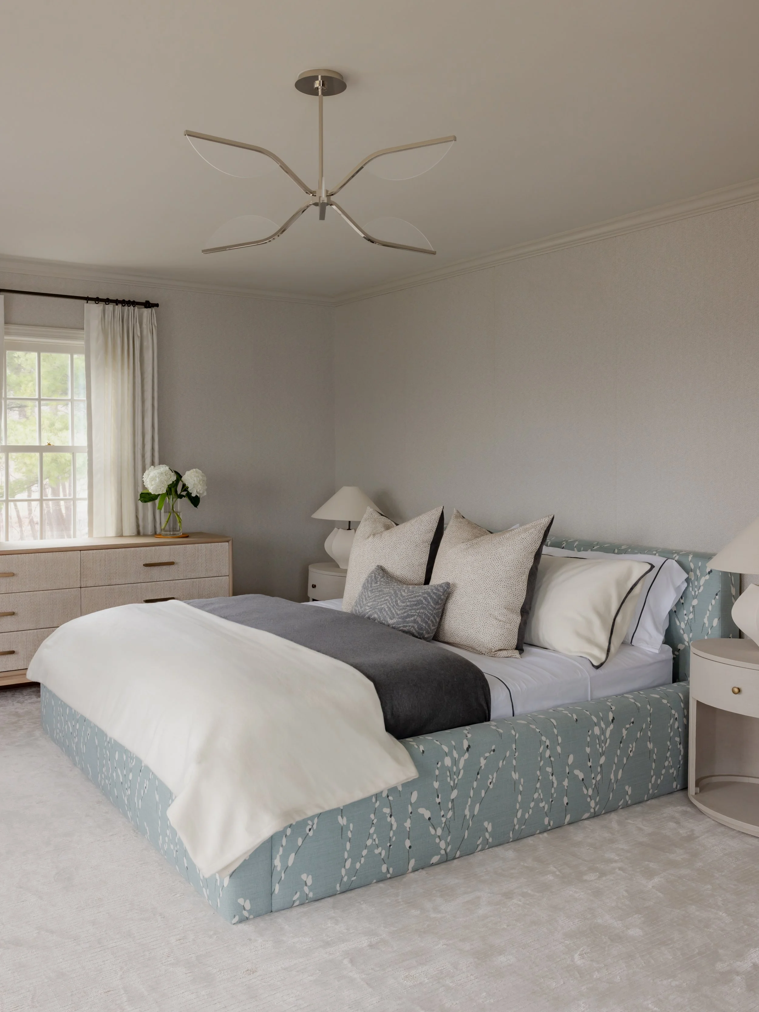
Like much of the house, the formal guest bedroom downstairs was outdated. We wanted it to feel serene and still have some personality, a calm, welcoming retreat for visiting in-laws. We added a textured wallpaper to the walls and upholstered the bedframe in a custom fabric, layering softness and depth without disturbing the room’s quiet.
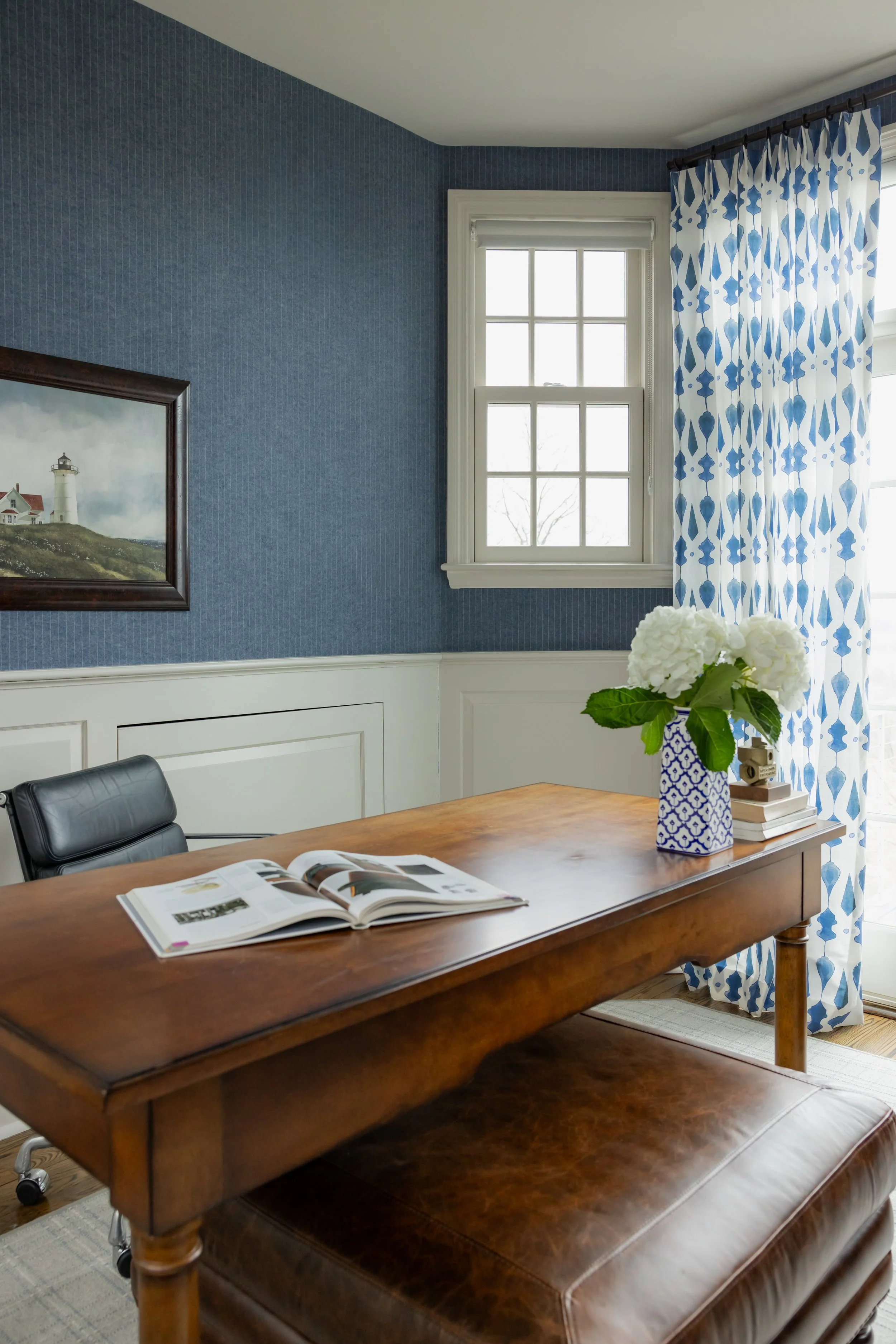
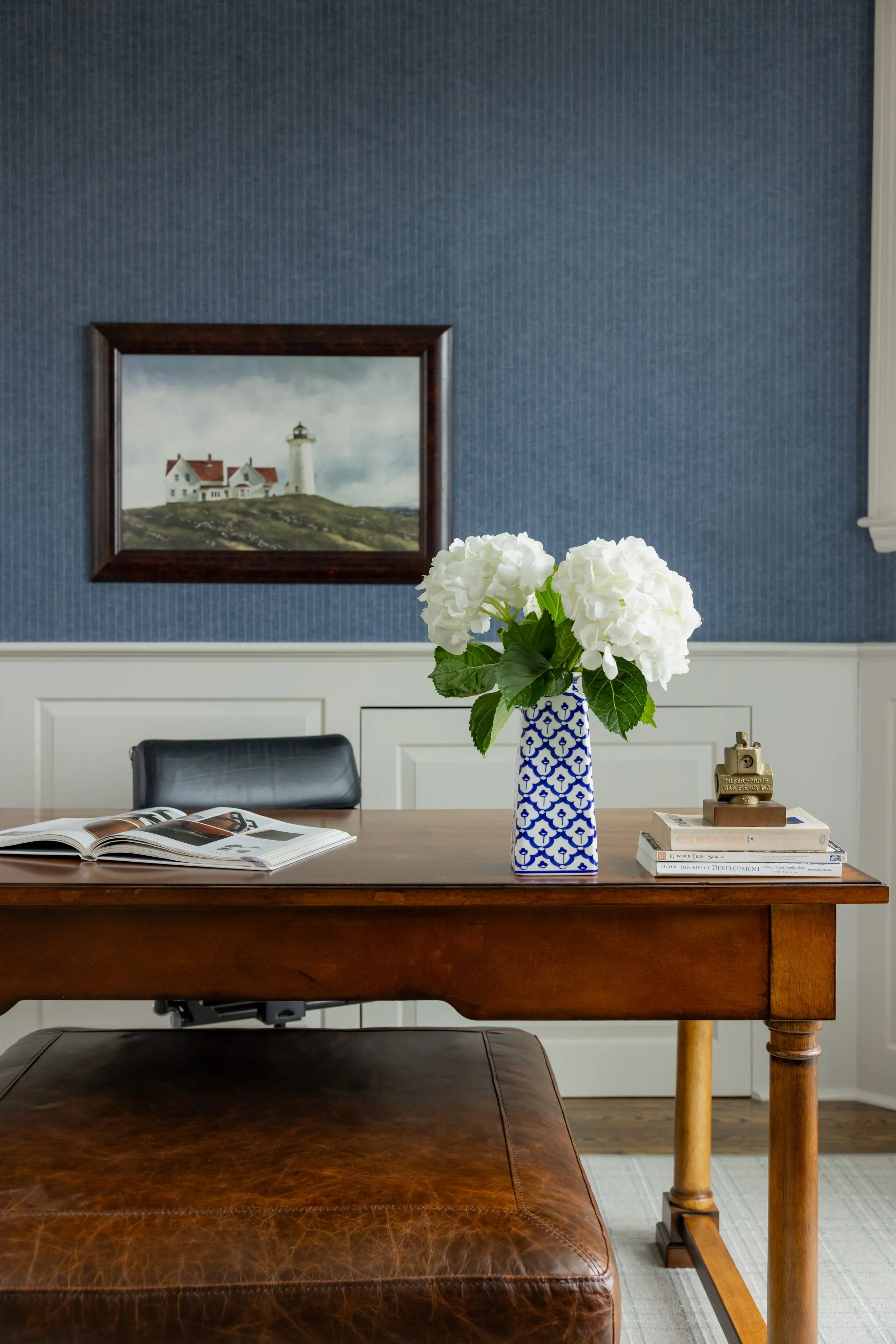
Tucked into the cupola of the house, the office called for something tailored and distinctly masculine. We started with a pinstripe wallpaper from Phillip Jeffries and built a blue, nautical palette from there, a natural fit for a room that sits at the top of the house like a lookout. We added a custom rug, changed out the lighting, and layered drapery over roller shades to give the room softness and control over the abundant natural light.